एक बगल में चॉंद होगा एक बगल में रोटियाँ

On One Side Lies The Moon, On The Other Lies The Bread

AUTHOR

Parag Kamal Kashinath Tandel

The title of this essay is a lyric that looks closely at the two complexions of the moon—as a star, and a metaphor for bread. It relates to the Son Koli community, comprised of fishermen in Mumbai, and their dependence on the moon. The functionalities, literal and allegorical significances associated with the moon since ancient times as well as today are pertinent to us, when many of Mumbai’s local, indigenous vocations and traditions are on the brink of extinction. Since the past decade and a half, there has been a shift of occupation in the Koliwadas (fishing villages) in and around Mumbai. Fisherwomen have started selling rice rotis to restaurants in Mumbai. Today, you will come across five to fifteen women in each Koliwada who produce between two hundred to four hundred handmade rotis every day. This is a direct consequence of the deserted river estuary and ocean, as well as rapid urbanisation and industrialisation which has polluted the water bodies of Mumbai, and ruined the naturally thriving environment of river estuaries and mangrove forests, depleting many species of aquatic life. This essay is part of a larger project that employs a socially-engaged performative research methodology to collect evidence in the form of intangible and tangible narratives related to the ecology of indigenous people. It is a long-term engagement to create handmade manuscripts in order to archive the shifts in the lives of communities living on the peripheries of the ocean. Each manuscript will be published as a work of art upon the culmination of the project.

Son Koli tribes are indigenous inhabitants of Greater Mumbai, Navi Mumbai, and Thane which together form a megalopolis. Their genealogies on the seven islands can be traced back to the Stone Age. There are more than 275 Koliwadas in and around Mumbai, and each Koliwada has its own social and cultural practices. Although the city has grown around them, these isolated villages have retained their own identities in Mumbai. They are self-sufficient, situated on self-sustaining lands, and not dependent on the city’s infrastructures. Koliwadas have their rich natural resources and cultural existence. But in recent times, these sea-facing villages are being eyed by developers as prime properties and as the land of opportunity. Can one imagine the fisherfolk community without an oceanfront? 

Illustration by RAO BAHADUR M. V. DHURANDHAR, A.M., F.R.S.A. In The peoples of Bombay By Percival Strip and Olivia Strip

Amidst the kaleidoscopic confusion that characterises the population of Bombay, Son Kolis stand out distinctly, retaining the essence of their traditional culture even today. A number of books, travelogues, documents, and articles have referred to the ‘Koli’ tribe. One common factor underlying all these references is that the Kolis are always associated with the fishermen of Bombay – “older than the coconut palm, older than the Bhandari palm tapper are the Koli fishing folk of Bombay among whom, if, in any one tribe, one must seek for the blood of the men of the Stone Age.”[1] Their degree of aloofness from the rest of the urban population and the slight amalgamation of the new with the old has presented a culture that is both elusive as well as intriguing. This elusive quality proved too attractive and led me to study their way of life, the extent to which they have been urbanised, as well as their ancestry. The questions addressed in this research project are: Are they as traditional as they look? Are they truly the original settlers of Bombay and the Konkan Coast as most texts describe them to be? Are they synonymous with the Mahadev Kolis? When did they cease being a tribe and why?

Out of the 275 villages in the megalopolis, my case study started with twelve Koli women from Chendani Koliwada in Thane (a central suburb of Mumbai). Chendani Koliwada is an ancient port which lost its traditional livelihood and local language a decade ago making it crucial to study the ecology of this village. It began with a contest of making a roti with the largest diameter and a revival of old, lost dried fish recipes. Handwritten recipes and narratives were recorded in a manuscript by these women from Koliwada. Being a visual artist, I mapped their oral narratives in the form of diagrams for each recipe. The women also treasured a few found materials from a nearby river estuary as evidence of the dead water bodies. The research-based performance culminated in an exhibition of found objects and various types of dried fish, used in the recipes, which were mummified by the women, symbolising the preserving of the evidence of loss.

The Son Koli is a matriarchal community. For the past few centuries, till the mid-twentieth century, they were traders whose major trade routes went through the ports of East Africa, Persian Gulf, Gulf of Oman, Gulf of Aden, Arabistan, Rangoon/Yangon and Sri Lanka. In those days, fishing was not such an intrinsic part of their lives, but rather a form of art or tradition. The men used to travel for six to seven months of the year, so the women were solely responsible for overseeing family matters. I see this present tradition of roti production as a stand taken by the women of the Son Kolis to be responsible for the sustenance of their families. Koli women take the lead in the management of domestic affairs, the entertainment of guests, the control of the family purse, and planning and participation in festive occasions.[2]

Sculptural outcome as evidence - Rice roti, thread and found straw mat.

Roti is a basic staple food that is a part of the daily breakfast in the community and wider region, accompanied by any dry fish dish. In the afternoon, Kolis have rice and fresh fish ambot (curry), as the women are busy segregating and drying the fish that they must cook instantly. For dinner, they eat roti made of rice flour and ambot again. Rice has been a common staple food for the past one and a half centuries. Earlier, roti was made of ragi, sorghum, and Patni rice. Conducting a contest was crucial, as selling rotis for a livelihood is seen as a very inferior job in the community as compared to fishing. The contest strengthened the morale of the women and moulded the minds of the community, much like what public sculpture is about – the ‘shaping of minds’.

Raw, dried mandeli/anchovies
Cooked, dried shrimps curry

It is an old ritual to collect and preserve dry fish for food security during pre-monsoon as fishing activities are halted in the monsoons because the seas are stormy and the fish need to mate to replenish their population. The Kolis believe that dry fish tastes best during this time. Dried fish recipes are also cooked on occasions like death ceremonies as a symbol to ensure a secure food repository in the afterlife. Preparations using these recipes cannot be found in restaurants; I still haven’t found any restaurant which exclusively serves dried fish, surely because of its overpowering odour.

Sculptural outcome as evidence - Mummified fish

Women mummifying dried fish

Later, I requested them to bring similar fresh raw fish which was cooked for the dry fish contest. Together we applied a coating of natural neem resin and lacquer on the fish which was dried and then wrapped in linen like in the Egyptian mummification process. The Egyptian mummification process was influenced by the ancient fish-drying technique that involved the use of salts to remove moisture, which is still used in the Kippered fish technique. Mummification has evolved since its invention and has been applied for many different purposes.   

The Blue Revolution is also known as ‘Neel Karanti’ and its goal was to attain economic abundance in the country and encourage the fisherfolks and fish farmers to participate and contribute towards food security in India. It was seen as an asset to generate revenue and create employment and livelihoods. Deep-sea fishing was introduced and highly recommended to artisanal fishing communities. The Blue Revolution introduced bottom trawling and midwater trawling. Bottom trawling is highly disadvantageous because the trawl is dragged across the seafloor, scooping up everything in its path, including non-edible marine species. This whole catch is then segregated into edible and non-edible/by-catch stock. The non-edible catch is then dried and crushed into a powder and supplied to animal husbandry, poultry, and fish farming industries. These farmed animals, poultry, and fish are grown in an unnatural, controlled timespan and environment. They are injected with steroid hormone implants used for growth, and to grow fast they need nutrition which is provided in the form of dry fish powder and other artificial supplements.

In 1960, the Maharashtra Industrial Development Corporation was founded and many heavy industries, chemical plants, and nuclear plants were set up in and around Mumbai. It seemed manageable for industries to discharge effluents into the estuaries of Mumbai back then. But they never thought of its impact on the future, which would result in deserted water bodies. These people have been trying to restore the fishing zones since the last few years, but their greatest setback has been the impact of the city’s untreated waste. The problem with waste discharged from human activity is that we don’t view it as an asset. We need to see it as an asset and develop a new culture of recycling and upcycling.

Architects, masterplan makers who develop vertical cities that include gardens, playgrounds, swimming pools, sewage pipelines, and other amenities, need to organise waste management and its treatment more efficiently. Oceans, rivers, and other natural water bodies are not dumping grounds for human waste.

Developers and architects must consider indigenous populations before planning new smart cities. The estuarial oceanfront villages are not slums but residential spaces of these communities that have been thriving since ancient times. These spaces have been designed keeping the social aspect in mind; the Koliwadas bring together minds and develop solidarity more organically as compared to vertical cities. There is an honour in this expanse which is lacking in the megalopolis. The knowledge system and cognitive skills of these indigenous communities are inseparable from their lands. Hence, it is important to understand that pollution not only leads to the loss of livelihood but also a slow degradation of their morals and beliefs of ‘Naturalism’ which is pertinent to their existence. 

Notes

1 The Bombay of the olden day has been described as “the desolate islet of the Bombay Koli fishermen” (Da Cunha, 1900:5), (Gaz.Bom.City & Ils, II ;2)

2 Strip, Oliva; Strip, Percival. The Peoples of Bombay.Thacker. 1944. P 21.

ABOUT THE AUTHOR

Parag Kamal Kashinath Tandel is a visual artist and sonic autoethnographer of the Son Kolis (fisherfolk) and indigenous people of Mumbai. He is the co-founder of Tandel Fund of Archives, a socially engaged ethnographic archive and pop-up museum of the Koli community. He lives and works in Thane, Maharashtra.

THE CURIOUS TRACES OF MASSAGE PARLOURS IN KOLKATA

AUTHOR

Santasil Mallik

In the streets and by-lanes of Kolkata, it is not difficult to register the ubiquitous presence of posters advertising massage parlours and “relaxation services” across the city. Printed in low-cost tinted papers with stock photographs of spa activities and contact numbers written in bold, they possess a unique visual currency. Usually, these prints appear clustered on walls, electricity boxes, or lampposts, marking an all too familiar break amid the corpus of corporate marketing. From the elite quarters of the city to shanty settlements, they connote particular conduits of consumption that often borders the illicit. But, notwithstanding the air of stigma and suspicion that sticks to the referents of these posters, their circulation suggests a unique landscape of desire in public visual modernity.

The recent spate of police clampdowns upon these enterprises has bolstered the image of parlours honey trapping customers under the pretext of massage services. From 2017 to 2020, the Kolkata Police conducted more than twenty raids, leading to the closure of many spas at shopping malls and streetways. In this recurring local news sensation, colloquially referred to as madhu chakra[1], spa managers get charged for human trafficking and sex workers are supposedly “rescued” by the authorities.[2] The occasional involvement of politicians or actors in these ‘sex rackets’ further spices up the news hour. Likewise, online discussion forums are replete with speculations and conspiracy theories, where anonymous users share different versions of a run-down narrative about getting deceived after following the posters.

It, however, does not go unacknowledged that massage parlours often provide fluid employment channels to many contractual or “flying” sex workers who function in a relatively upscale market or through informal networks of escort services.[3] Interestingly, despite the enterprises’ vilified status by law and general perception, their posters are hyper-visible in the public space. It betrays the furtive covenants involving police authorities, a rupture of whose conditions potentially lead to such violent clampdowns. The peculiar aesthetic field of these paper prints, therefore, operates in the slippery regions between the visible and the conspiratorial, the upmarket and the profane, or the licit and the illicit.

In his book Passionate Modernity, sociologist Sanjay Srivastava coins the term “footpath pornography” while studying the form, content, and spatial distribution of cheaply produced pornography booklets sold in the streets of Delhi. He situates these print productions in conjunction with “other vernacular print cultures where sexuality is a consistent and well elaborate topic of discussion”, including posters of unauthorised sex-clinics or sexual advice leaflets.[4] The advertisements of spas and massage parlours in concern further expand the scope of this category. Here, sexuality is not a direct point of address but gets closely implicated by the associations these prints have developed in civil society. They share similarly (un)structured communication networks, reflecting the “erratic signs of illicit economies of the city.”[5] Their advertising rationale corresponds to subterranean markets that work around a distinct regime of public cognisance.

These “footpath” print cultures, navigating sexuality and sexual services, activate a disjointed viewing experience befitting the rhythm of street commutation. [6] Most of the massage parlour posters are site-specific, concentrated in and around locales where the establishments are based. The clientele distribution map, therefore, largely depends on commuters’ acquaintance with the particular city quarter. In localities with several establishments, familiar posters compete over unratified spaces to form multiple strata of arresting collages. Such competitive sites invite a unanimous field of response due to the prints’ formal homogeneity. Instead of an individual poster, multi-layered collage sites become the locus of attention. Nonetheless, any overarching propositions about the posters’ visual coordinates are subject to contestation, given the unstable business and promotion models they manoeuvre. 

While the advertisements appear attuned to male heteronormative expectations, massage parlours proffer ambiguous forms of sexual communication that are usually premised on secrecy and dubiety rather than necessarily nonconformist sexual motives.[7] They are also potent avenues for male commercial sex workers, many of whom have had unintentional beginnings in the parlours before becoming attuned to the trade. Kunal Basu’s novel, Kalkatta, precisely uses this context as the narrative’s background where Jamshed Alam, a second-generation Muslim migrant, takes up sex work in an elite escort service masked behind the façade of a massage parlour.[8] Written in Alam’s voice, the novel infuses predictable themes of adultery, sexual exploitation, migrant crisis, terrorism, and the black market economy in a heady mix, underscoring all the anxieties that inform these spaces. It is easily discernible that the visibility of massage parlour posters in the city builds upon the subtextual discourses of pleasure and illegality.

In the limited-edition photography book, The Veil of Maya I, French artist Tiane Doan Champassak conceives the signification of this print culture in Kolkata from an altogether different, spiritual-allegorical perspective. It is the first publication from his ongoing, seven-part The Veil of Maya series which deals with the idea of “the duality of enchantment-disenchantment.”[9] In January 2018, he photographed layers and traces of these colourful posters that clung to the walls like “an aesthetic bacteria”[10] and incited mixed feelings of attraction and repulsion in him. More than the representative values of the ads, the work engages with the materiality of the print collages. The cheap texture of the posters – “the flayed skin of the city”[11] – becomes a surface to play out the tensions between promise and fulfilment in the metropolis.

Champassak’s book project strives towards “an editorial ideal of copiousness”, worth 2000 pages, whose goal is “to have the viewers flip through pages of the book as if they were touching the walls of Kolkata.”[12] Shot in less than four days, his “photo marathon” enunciates the collages as “city palimpsests.”[13] It strongly resonates with this print culture that resides in Kolkata’s subliminal visual consciousness. In tatters and unformed juxtapositions, the paper flakes of promises project a map of pedestrian desires and parallel economies. The semantics and contextual meanings of the posters exist in conversation with the textural surfaces of the print layers and their street spatiality. As a result, anyone traversing this inconstant landscape cannot help but be animated by ingenious patterns, collages, and accidental aesthetic formations lurking around the next street corner.

Notes

[1] Honey trap inside Spa centre at Kasba in kolkata, seven arrested (sangbadpratidin.in) 

[2] 29 Sex Workers Rescued from Spa, Saloon in Kolkata; 30 Including Brothel Managers Held (news18.com)

[3] Dasgupta, Satarupa. “Commercial Sex Work in Calcutta: Past and Present”, Selling Sex in the City: A Global History of Prostitution, 1600s-2000s, Brill, 23rd August2017, p. 519

[4]Srivastava, Sanjay. Passionate Modernity: Sexuality, Class, and Consumption in India, Routledge, 2007, p. 167

[5] Srivastava, Sanjay. Passionate Modernity: Sexuality, Class, and Consumption in India, Routledge, 2007, p. 167.

[6] Srivastava, Sanjay. Passionate Modernity: Sexuality, Class, and Consumption in India, Routledge, 2007, p. 175

[7]Boyce, Paul and Akshay Khanna. “Rights and representations: querying the male-to-male sexual subject in India”, Culture, Health, and Sexuality, Vol. 13, No. 1, 2011. p. 95.

[8] Basu, Kunal. Kalkatta, Pan McMillan India, 2015

[9] The Veil of Maya 1 – Tiane Doan Na Champassak  (THE VEIL OF MAYA 1 on Vimeo)

[10] The Veil of Maya 1 – Tiane Doan Na Champassak

[11] The Veil of Maya 1 – Tiane Doan Na Champassak.

[12] In an email interview with the author

[13]In an email interview with the author

ABOUT THE AUTHOR

Santasil Mallik is a visual artist and researcher currently pursuing his M.Phil from the Centre for English Studies at Jawaharlal Nehru University, New Delhi. His research focuses on the intersections of literary and visual cultures in the modern political history of Bengal. As a practitioner, he is interested in exploring formalist, non-narrative approaches to filmmaking and photography. His works have been exhibited at several spaces across Switzerland, Italy, Columbia, Germany, Bangladesh, Vietnam, and other countries.

A Proposal: Women in Matrimonial Photographs

Author

Cheryl Mukherji 

Still from Main, Meri Patni, Aur Woh (2005). YouTube.

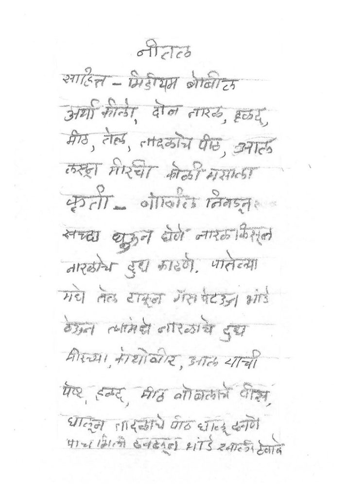
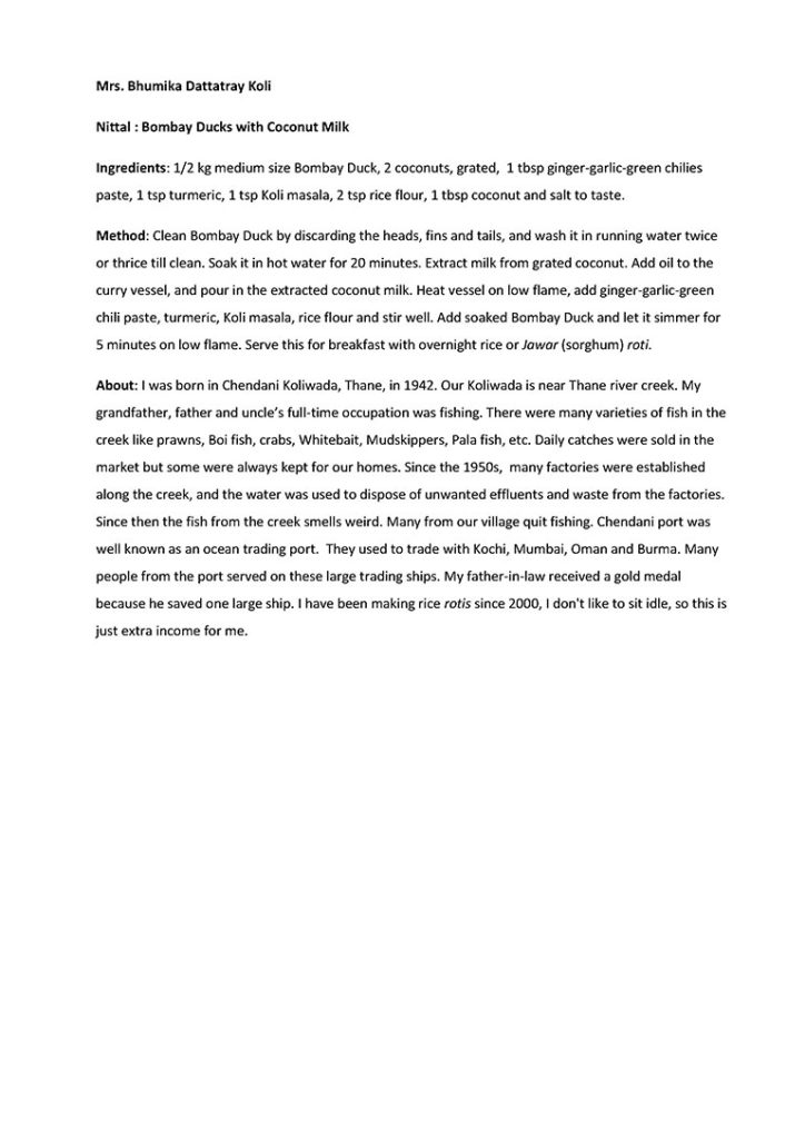
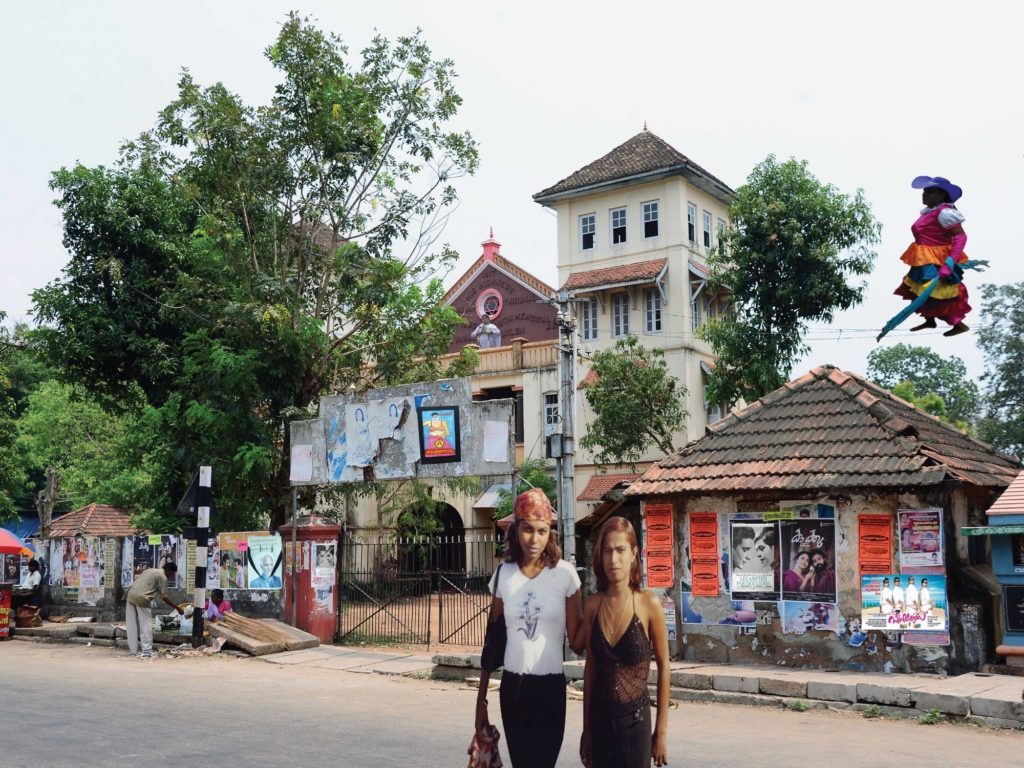
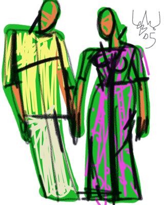
The Bollywood movie, Main, Meri Patni Aur Woh (2005), follows the marital life of 34 years old Mithilesh Shukla, a librarian at Lucknow University. The movie opens with a scene in the university cafeteria where Saleem, Mithilesh’s best friend excitedly runs to hug Mithilesh. There is a photographic print the size of a postcard in his hand. Saleem holds it up and promptly asks his friend: ‘Kaisi lagi?’/How is she? Mithilesh, confused and hesitant, replies with ‘Kya matlab ki kaisi lagi?’/What do you mean by how is she?. As the narrator voices that Saleem’s mind has been preoccupied with marriage: ‘Yehi hain jinke saath humey zindagi guzarni pad sakti hai’ /She is the one I might have to spend my life with, it becomes clear that the photograph he’s holding is matrimonial.

As Saleem pesters on, Mithilesh shows no interest in seeing the photograph, implying that it is meant only for Saleem. He says that he must decide based on their compatibility and understanding instead of her looks. Saleem looks at the photograph once again, before he points to another woman in the distance in the cinematic frame and exclaims, ‘Isse fair toh wohi hai…kam se kam utni fair toh honi chahiye na!’ /She is fairer than her, one should at least be this fair, right!, turning a deaf ear to Mithilesh’s advice.

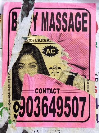
The photograph is handled, viewed, and critiqued in the minute-long scene. One sees an impression of a portrait of a woman in the pixelated movie print for a moment and learns only one thing about her: she is not as fair as Saleem would like. The photograph stands in for the absent woman, evoking desire and scrutiny at the same time. Its meaning rests in its function: an arranged marriage proposal.

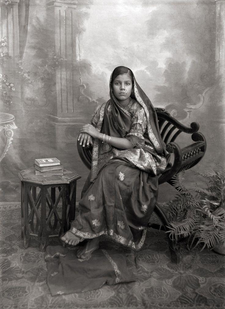
Suryanandini Narain, in her essay Photographing the Feminine, writes, ‘The phenomenon of the matrimonial photograph is a necessary aid to the arranged marriage system where the bride and groom do not see each other in person until the families approve, and hence the image acts as a substitute for personal interaction. …It reaches destinations where a young woman of marriageable age would not have access to, either due to conservative social restrictions, or the unfamiliarity of the audience, or simply physical distance.’[1]

A printed matrimonial photograph is usually 4 by 6 inches in size, unframed, and constantly in transit along with other documents like the biodata and horoscope, which constitute a package sent to prospective brides and grooms in the modern arranged marriage market. Rochona Majumdar, in her book Marriage and Modernity: Family Values in Colonial Bengal, argues that arranged marriage is a modern practice because its performance from the late nineteenth century involves usage of institutions and ideas central to any understanding of modernity: urban life, Western education, the print media (the publishing of matrimonial advertisements seeking brides and grooms), monetisation of relationships (the escalation in the practice of dowry), and marriage laws—as a result creating new patriarchy under colonial rule in India.[2]

With the rise of matrimonial advertisements published in national dailies, a market for arranged marriage flourished over the years, where prospective brides and grooms sought their life partners. Within this market, the matrimonial photograph becomes a token of ‘visual currency’, in terms of John Tagg’s definition of ‘items produced by a certain elaborate mode of production… distributed, circulated, and consumed within a given set of social relations: pieces of paper that change hands, find use, meaning, and value in certain social rituals’.[3] Moving through the various stages of the arranged marriage market, the matrimonial photograph takes on various meanings, evoking aspiration, desire, and alliance—sometimes, all at once.

Matrimonial advertisements in Times of India, 1992. Courtesy of the University of Pennsylvania Library.

Men, in matrimonial advertisements, are mainly valued for their professional qualifications and social status while women must unequivocally be good-looking over other attributes of education and appropriate caste. Emotional attachment to caste has persisted through the years. While the internal subdivisions within each caste have become a matter of relative indifference, affiliation to a caste group is an important mark of identity in contemporary Hindu society. Arranged marriages, and in extension matrimonial advertisements, become a space for people to exercise this identity. Since caste is the focus of aspiration and the mobilisation for the pursuit of group or individual interests, participating in this market means that people, often exclusively, seek alliances with families of the same caste or higher.

This aspiration translates visually into matrimonial photographs, making the portrait of an eligible bride in the advertisements evoke images of contemporary Victorian ladies[4] with visual signifiers of wealth and education (heavy jewelry, embroidered and bright clothes, books on a table, etc.) in the printed photograph.

Portrait of a seated lady, 1930. Pinterest.

My mother’s family, as upper-caste Bengalis, started seeking an ‘equal’ match for her when she turned 21. She had her matrimonial photographs taken every year from the age of 22 to 26, by the same photographer at her medical college who photographed surgical specimens and cadavers. Amassed over several summers, this collection of matrimonial photographic prints are a record of my mother’s twenties—when she was as old as me. In her first matrimonial photograph, a postcard size print with round corners, my mother wore a dull-red saree with a gold border lining its edge. It lay in at the back of her closet, until the decisive moment, only to be captured in an out-of-focus photograph.

She stood in her grandmother’s garden, looking in the distance with a half-grin.
Her hair was short enough to barely cover her ears.
She wore a gold bangle on each of her wrists.

In some of the photographs taken over the years, she posed in the same garden but wearing different sarees, holding the half-grin and hands by her side. In other photographs, she posed sitting in her living room or kitchen, surrounded by her belongings, pots and pans, flowers in the vases—always blooming—and her hands rested gently on her knees.

The preference for the ‘poses’ within a domestic setting, reflects the bride’s qualities and responds directly to the matrimonial advertisements which seek ‘a beautiful home-loving girl’. For women, eligibility is determined by a domestic ideal that includes proficiency in household tasks—coded within expressions like ‘skilled in domestic work’ in advertisements—a modicum of education, and a high premium on good looks.[5]

The matrimonial photograph operates on identities—constructing them rather than expressing them. How Barthes describes the image of his mother who finally achieved what he calls ‘the impossible science of the unique being’[6] contrasts with the portrait traditions employed in the making of a good matrimonial photograph. A matrimonial photograph must represent a woman’s internal qualities as they are constructed to cater to the male gaze within the patriarchal marriage system.  A good photograph is where a woman performs prescribed notions of femininity—like sitting with her legs crossed, knees to the side, hands resting on her knees, a demure gaze, a suggestive smile, and dressed in her traditional best. A prospective groom’s family would often request two matrimonial photographs: a close-up and a full-length portrait. They would be judged based on spotlessness of skin, fairness in complexion, sharpness of facial features, height, and build—conforming to eurocentric standards of beauty and desire.

My mother’s matrimonial photograph. Courtesy of the writer.

John Berger, in his collection of essays Ways of Seeing, suggests, ‘From earliest childhood [a woman] has been taught and persuaded to survey herself continually. And so she comes to consider the surveyor and the surveyed within her as the two constituent yet always distinct elements of her identity as a woman. She has to survey everything she is and everything she does because how she appears to others, and ultimately how she appears to men, is of crucial importance for what is normally thought of as the success of her life….One might simplify this by saying: men act and women appear. Men look at women. Women watch themselves being looked at. This determines not only most relations between men and women but also the relation of women to themselves. The surveyor of a woman in herself is male: the surveyed female. Thus she turns herself into an object—and most particularly an object of vision: a sight.’[7]

In privileging the male gaze, the extraordinary creativity of many feminine self-representations gets lost. This is not by any means to suggest that the matrimonial photographs of women are not expressive of agency and individual desire. They embody highly personal non-collective yearnings and fantasies. The question here is not so much the presence or absence of ‘the individual’, but rather the nature of the chronotope in which the body is made to appear.[8]

A matrimonial photograph is potent with possibility, imagination, and a desire for a future that two people want to create together—an alliance. While appearing as the potential wife of one, the woman in the photograph allows for multiple suitors to behold her identical image across various contexts. The printed form of the photograph makes this experience singular and confidential. If the photographs are approved by the prospective groom’s family, an in-person meeting is organised to discuss marriage prospects. If the photographs are rejected, it is normative to send the prints back to the family—failing to do so is deemed extremely disrespectful.

My father was in correspondence with another woman when he received my mother’s matrimonial photograph as a proposal. He ultimately selected my mother’s photograph—a full-length portrait of her wearing a red saree with floral motifs on it. As I insist, he recalls more details—a rug, a vase, and my mother’s short hair. My father jokes about how he had forgotten to send the photographs back to the woman he pursued briefly before, which was met with criticism and a lengthy letter sent by her father, stating his disappointment in him with harsh language.

Narain writes, ‘The “life” of the photograph after its function in the matrimonial dialogue is also translated in material terms as it appears in family albums of the married couple or one of their natal families, framed and hung on walls or placed on tables, or forgotten among other objects in places of storage. Memory and materiality are closely connected in the matrimonial photograph that is responsible for changing family configurations through conjugality, although its utility after marriage is highly diminished in comparison to its prior significance.’[9]

My mother’s matrimonial photographs now rest within my family albums as a sub-archive. They’re uncared for and shoved into plastic slots between photographs from unrelated events in the album. These photographic prints, over the years, have faded in color. They bear scratches from hands they have passed through and flaunt the dried glue marks behind them with pieces of paper still stuck from the album pages they were ripped from. They are a visual testimony of my mother’s experience being photographed as a prospective bride, one that is formative for many young women who came before and after her, including me.

Spread from my family album. Courtesy of the writer.

The matrimonial photograph is one of the multiple ways in which women have been portrayed through visual means in social institutions such as marriage in India. The printed photograph appears at the point of culmination of historical and sociological forces and the point of origin for new systems of material and visual dissemination. Today, the matrimonial photograph transcends its boundaries concerning privacy and dignity, yet foregrounding the same (if not more nuanced) ideas of self-representation, aspirations, desire, and alliance in its digital form—its meaning still resting in its function: a proposal.

Notes

[1] Narain, Suryanandini. 2011. “Photographing the Feminine: a Study of Women as Subjects of Photography in Indian History since Late 19th Century.” Framing Women: Gender in the  Colonial Archive (MARG) 62.

[2] Majumdar, Rochona. 2009. Marriage And Modernity. New Delhi: Oxford University Press. 2.

[3] Tagg, John. 1993. The Burden Of Representation. Minneapolis, Minn.: University of Minnesota Press. 164.

[4] Majumdar, Rochona. 2009. Marriage And Modernity. New Delhi: Oxford University Press. 52.

[5] Majumdar, Rochona. 2009. Marriage And Modernity. New Delhi: Oxford University Press. 41.

[6] Barthes, Roland. 1993. Camera Lucida. Vintage Books. 66.

[7]  Berger, John. 1972. Ways Of Seeing. London: Penguin. 45.

[8] Pinney, Christopher. 1997. Camera Indica. London, Eng.: Reaktion Books. 195.

[9] Narain, Suryanandini. “Photographing the Feminine: a Study of Women as Subjects of Photography in Indian History since Late 19th Century.” Framing Women: Gender in the  Colonial Archive (MARG).

About the Author

Cheryl Mukherji (b. 1995, India) is a visual artist and writer currently living and working in Brooklyn, New York. She graduated with an MFA in Advanced Photographic Studies from the International Center of Photography-Bard College, New York in 2020. Cheryl has been a recipient of the ICP Director’s Fellowship for the years 2018-2020. In her current work, Cheryl explores the idea of origin and inheritance, which is embedded in the figure of her mother and her presence in the family album. It deals with memory, personal history, transgenerational trauma, and how they inform identity. Cheryl primarily works with photography, text, and video. Cheryl has been the recent recipient of Capture Photography Festival’s Writing Prize (2020), Brooklyn Museum’s #Your2020Portrait award, Firecracker Photography Grant, and was nominated for the inaugural Next Step Award by Aperture Foundation and Baxter St at the Camera Club of New York. Her work has been exhibited at the Format Photo Festival (UK), Brooklyn Museum (US) Museum of Moving Image (US) International Center of Photography (US) Serendipity Arts Festival (IN).

https://www.instagram.com/cherylmukherji/

Drawing Dissent: Political Cartoons in Modi’s India

Author

Prabhnoor Kaur

Orijit Sen, ‘Modilini’, https://web.archive.org/web/20210604120214/https://caravanmagazine.in/vantage/self-censorship-is-like-a-termite-that-eats-society-from-within-an-interview-with-orijit-sen

In early 2014, Indian cartoonist and graphic novelist Orijit Sen, angry at the state of this country posted one of his latest works on Facebook.[1] The work featured the face of Narendra Modi on the body of a soldier. The heading reads ‘Benito Bhai’ on one side, while the other says ‘Modilini’, a portmanteau of Modi and Mussolini. The cartoon of Modi claims to be Italian (in Gujarati) while the pedestal he is standing on labels him as a fascist. In a country where censorship is on the daily rise, what compelled Sen to make such a statement? Further still, why share this cartoon instead of simply making his claim?

Political cartoons work along an axis of semiotics, or signs standing in for larger ideas that can be read through the lens of context. These cartoons work in hyperbole – satirising situations and aggrandising characters. Political cartoons are effective due to their use of humour as a tool of reflection on the often dire and depressing realities of our world. Humour creates a sense of community, as it is often a shared experience. In the case of political cartoons, the shared experience is between the cartoonist and the reader, and the shared experience of living in the same context that the cartoon dialogues with. Cartoonist Orijit Sen echoes this thought, ‘At some level, my work uses humour and satire and poking fun as a method – it’s actually a form of distilled anger. […] A lot of work comes out of this sense of feeling hopeless and frustrated.’[2] This approach to use humour to explore deeply heavy subjects effects the core functionality of political cartoons by working along the axis of theories of incongruity, in which absurdity, parody, and humour are used to break patterns of assumption of what is ‘normal’.[3]In this case, by channeling the anger through humour, the cartoonist invites the readers to consider where the punchline lies.

Satish Acharya Satish Acharya, ‘News channels ignore farmers’ protests!’ Twitter, September 14, 2020. https://twitter.com/satishacharya/status/1305390518986186752

This anger came to a head when, in the midst of a global pandemic, the Modi government passed laws that would open up Punjab’s agricultural sector to the global free market. Farmers that were already under boulders of debt knew this meant that they would be priced out, leading to destitution. Farmers began to speak out against these bills, protesting in their states, yet their voices were not heard. Cartoonist Satish Acharya posted one of his works on Twitter, featuring farmers climbing over a TV set, trying to dig their way into the news that only pays attention to Rhea (Chakraborty) and Kangana (Ranaut). Within the frame of this drawing, we see a sea of farmers behind the television set – calling attention to the number of voices being pointedly ignored. The scaling up of the TV points to the crucial role played by the media in shaping our social consciousness; hence placing importance on the effort to be heard by the farmers by climbing onto a TV set thrice their size.

Ponnappa Nala Ponnappa, ‘Farmers First. [Social distancing],’ Twitter, September 19, 2020. https://twitter.com/PonnappaCartoon/status/1307144081982631936

Amid the pandemic, millions of farmers and their supporters took to Delhi to protest these laws. Still, the higher ups refused to meet with them. Nala Ponnappa highlights the irony of this in his cartoon, which shows an exhausted farmer, PM Modi and ‘the middle-man’. This cartoon depicts the PM and the middle-man standing side by side, proclaiming social distancing. Moreover, the middle-man is nowhere close to the middle! Ponnappa’s cartoon with a wink and a nudge makes the reader consider all the excuses being offered for the lack of negotiation.

The farmers occupied the perimeter of the city, blocking highways and refusing to be silenced. The authorities pushed back, constructing blockades and spraying the protestors with water.[4] This protest was the largest worker strike in history, joined by supporters from all across the country and beyond.[5] No concessions were made. Figures from all over the world called attention to the movement, and still no response. As winter sunk in and there seemed to be no end in sight, many farmers lost or ended their lives – a count from May estimating around 500.[6]

Noor Noor, Farmer Suicide, shared November 28, 2020

A cartoon shared by a Twitter user, signed only with the artist tag ‘Noor’, depicts a haunting image: PM Modi stands addressing a crowd, microphone in hand. The cord snakes behind him and a farmer has fashioned a noose from it to hang himself. Again, there is the same turning of the back from the PM. The cartoon clears that the bells and whistles rung are to distract us from what is happening behind the scenes. The fanfare covering up farmer’s voices becomes the weapon of crime. Over 4000 people liked this image on Twitter, and 6000 retweeted it. Without any words or captions, this image resonated simply through a shared context and timeliness. It implicated those in power without saying anything.

In traditional print media, political cartoons work in tandem with an editorial or text, but with the internet landscape, these images are shared without that supporting context. It is assumed that the person engaging with the work will understand the references, as they are in our internet stratosphere, which often works as an echo chamber, curating feeds to reflect personal beliefs. Within the late-stage attention economy shaped by easy, consumable news bites and Instagram infographic culture, political cartoons are already cut to size.[7] As such, political cartoonists such as Noor can disseminate their work without the reliance on mainstream print culture and receive immediate engagement and response. In the image-proliferated internet, the political cartoon lives as its own entity as opposed to a supplemental point to a written text.

The role of political cartoons is diagnostics, not remedy. By nature, cartoons exaggerate certain details and make wry comments to convey the heart of the issue. For those who are clued into the conversation, are able to make the connections or at least understand the sentiment. As the saying goes, a picture is worth a thousand words. I would like to return to the Orijit Sen image: the statement Sen is making, of calling Modi a fascist, likening him to infamous Mussolini, is certainly not spoken in isolation. However, the quippy nature of the comment as well as the dichotomy of the image from the persona of the PM (in a kurta and a vest) makes Sen’s cartoon a mainstay in memory. Within the context of the cartoons by the other artists, as well as from lived context, the parallel Sen is drawing does not seem so farfetched. By and large, the role political cartoons play in dissent is to expose the truths about their subject by making them larger than life. Where an editorial examines a situation, propose ideas, and explanations; political cartoons instead act as catalysts to bring to light the reader’s own understandings of the context. In that sense, an editorial can be looked at as a window where a political cartoon serves as a mirror. It pushes the reader to lean in look closer. Under that magnified gaze, readers of the cartoon are able to see the myth-making at work – as Acharya, Ponnappa, and Noor clearly point out, the myth being crafted about Modi is his negligence. It is the refusal of the demands of the country’s people in favor of international corporate interests. The point of political cartoons is to channel anger through a pen, to see the characters through the eyes of the artist, and to do something. They are a call to action.

Notes

[1] Samira Bose, “’Self-censorship is like a termite eating a society from within’: An Interview with Orijit Sen,” The Caravan, December 25, 2015, https://caravanmagazine.in/vantage/self-censorship-is-like-a-termite-that-eats-society-from-within-an-interview-with-orijit-sen.

[2] Kanika Katayal and Bharathy Singaravel, “Orijit Sen: The idea of India is under threat now more than ever,”Indian Cultural Forum, March 29, 2019. https://indianculturalforum.in/2019/03/29/orijit-sen-the-idea-of-india-isunder-threat-more-than-ever/

[3] Dan O’ Shannon, What Are You Laughing At?: A Comprehensive Guide to the Comedic Event (New York: Continuum International Publishing Group, 2012) : 35-37. 

[4] Varinder Bhatia, “Explained: Who are the Punjab, Haryana farmers protesting at Delhi’s borders?”, The Indian Express, January 30, 2021. https://indianexpress.com/article/explained/punjab-haryana-farmer-protests-explained-delhi-chalo-farm-laws-2020/

[5]Nitish Pahwa, “Why India just had the biggest protest in world history,” Slate, December 9, 2020. https://slate.com/news-and-politics/2020/12/india-farmer-protests-modi.html

[6] Anju Agnihotri Chaba, “477 protesters died during six months of Delhi morcha, 87% from Punjab: SKM”, The Indian Express, May 27, 2021. https://indianexpress.com/article/cities/chandigarh/477-protesters-died-during-six-months-of-delhi-morcha-87-from-punjab-skm-7331842/

[7] Jenny Odell, “The Anatomy of Refusal”, How to Do Nothing: Resisting the Attention Economy (2019) Melville House, London, 63-95

About the Author

Prabhnoor Kaur is a writer and creative based in Delhi-NCR. She holds a BA in Art History and BA in Screenwriting from Chapman University in Orange, California. Her research interests include print culture and the history of South Asian labor in the West Indies. When not writing, you can find her making fresh pesto from her beloved basil plant.

The Collage is Queer: Three Artists, Three Approaches

Author

Joshua Muyiwa

When the saints go marching at SMP Palace, Aryakrishnan R.

The Birth of the Collage

It wasn’t until the early twentieth century, when Georges Braque or Pablo Picasso started gluing paper onto the canvases of their geometrical paintings, to fight the ‘flatness [that] had not only invaded but was threatening to swamp the Cubist picture,’ as explained by the American art critic Clement Greenberg1. In doing so, they stumbled onto the new modernist art form of the collage. This technique comes from the French word, coller, to glue. 

Hannah Höch, a German Dadaist, ran with this form. Her photomontages were a means to access the subconscious, political and absurd. She was hell-bent on dismantling the myth of the ‘new woman’ which was a term used to describe the newly-emerging feminist – educated and independent women of the mid-twentieth century. Through works like Das Schone Madchen/The Beautiful Girl (1919-1920), Hannah reconfigured and reframed photos from women’s magazines to question this new notion of the modern woman. 

The collage allowed for the pushing together of fragmentary materials from different spatiotemporal situations to reveal something else. The collage, much like the daily central practice of the queer subject, is tasked with constructing new worlds and identities from the same materials as everybody else. The act of collaging resonates with the queer subject’s ability to recast violence, to rearrange the aggressive and to reflect the substance in style. 

It is this possibility of something else to emerge that caught the magpie eyes of queer artists like David Wojnarowicz, who expanded, extended and exploited this space to tell different stories using the mainstream images that were utilised to critique the AIDS crisis of the 80s. In seeking to figure out this relationship between queerness and collage, this essay will speak of three queer Indian artists to understand their impetus and interest with making such works.

Manipulating Media And Memories

Aryakrishnan R, a Kerala-based artist-curator has always cut clippings from the newspapers and magazines in a bid to identify with something. He collected and collated everything from write-ups about Oscar Wilde to the Sydney Mardi Gras. Though, he has found himself with mostly crime stories and oddities like ‘a hen becoming a rooster’ but all of these things were the bits and bobs to make up his own history in the pre-Internet era. 

Sweet Maria Monument_Performance, Aryakrishnan R

One of his first impulses towards the technique of collage was the want to ‘do things with the headlines’ but without necessarily writing anything. He started purely by accident; shuffling the material, cutting up the headlines and wondering ‘if cutting up the text’ rendered them as images ‘and therefore allowed for another kind of reading’. He followed his gut feeling and even though he started off with nothing, cutting up and gluing them as materials onto a surface ‘revealed a new beauty’ towards the end for Aryakrishnan. He found that the resulting work had undone, unlocked and uncovered ‘a different potential’ that wasn’t simply illustrative. ‘We weren’t given things to identify with,’ says Aryakrishnan of his years growing up in the 80s, ‘so I was actually taking things not meant for me and making it fit as something else for me, this [collage] seemed an extension of that endeavour.’

For Aryakrishnan, the process of putting together a collage helped him create new meanings from stacks of ‘broken images’ squirrelled away from a brief moment in a film, a throwaway line in a song or even a headline about a violent crime in the newspaper. Over the years, he has been able to coax out a vocabulary that has emerged from ‘painstakingly doing the work of parsing new meaning’ guided by his practice of using materials already in the world.

Sweet Maria Monument Installation View, Aryakrishnan R.

In 2018, as part of the Kochi-Muziris Biennale, Aryakrishnan presented Sweet Maria Monument, which was a physical collage of prints, performance and paraphernalia that marked the life and death of Maria, a transgender activist, who was brutally murdered on 10 May at her home in Kollam, Kerala. Through this work, much like his collages, he manages to manipulate not only media but also memories to leave the audiences with something new, something else. We’re left with a different take on the world, and a layered look at the life of a trans person. 

Play, Postcards and the Physical World

This must-have skill of the queer subject to ‘restructure’ the world around them in order to find a footing aligns with the process of the collage for each of these artists. Approaching and analysing this task of remaking differs among them. For the artist Sandip Kuriakose, his early work was interested in using borrowed images from pop culture ‘that had some kind of history’. Similar to Aryakrishnan, he understood that these images came with their own framing and the ‘value to reframing it’. While Aryakrishnan’s work has opened up to gluing together drawings, drama and design to fill up an entire room – allowing for an immersive experiencing of the something else; Sandip’s work, tries to ‘understand spaces’ to provide us with a ‘printed postcard’ made up of the snatches of colours, contours and the covertness of cruising spaces2.

Boys in the Jungle, Sandip Kuriakose.

In a way, Sandip has arrived at giving his work with collage a different effect while still using the basic techniques of the form. He isn’t limited by the borders of the four corners of a canvas, or of a room, but rather likes things ‘to push out, to have some kind of spillage’ and challenge the ‘restriction of the frame’. This move in his practice is from observing the ways that cruising spaces are ‘a restructuring of space, not just ideological, in the sense that these public spaces aren’t meant for that, yet there are queer men who seamlessly see it for its sexual possibilities and potency’.

In his on-going series, Woh bhi line ka tha3, Sandip uses collage as a starting point for ‘its ability to put things from different sources together to create a new image’ and also as an aesthetic choice seen in ‘the jarring disjuncture between Image 1 and Image 2’. He points out these markers in his present works when he points out these disjunctures between flat background and object, between colours and textures, between Thing 1 and Thing 2. 

Pink Rocks, Sandip Kuriakose.

Presently, Sandip continues to play with the elements of the collage process. It plays with his audience too – inviting those who might not know, to be drawn by the work and the thought gone into creating his pretty, precise and potent images. But for those in the know, it works as postcards from a queer utopia – where even a little corner of a park, dumped with garbage, has the potential to be seen as a secret, somewhere else

Figuring Out Fantasy

This nose for beauty, an eye for fantasy and the handy ability to edit together text and image to present an interesting story are the gifts of being queer; of being unconsidered by the mainstream. And collage, as a medium and a process, has engendered queer artists to share their thoughts, topography and textures of our shared world. Bangalore-based artist Renuka Rajiv’s works embody these gifts in the way that her canvases – both small and large – have this pull of portals. On diving in, it is populated with figures that aren’t defined by their genitals lounging in multicoloured fantastical spaces where shapes are sexy, and everything is in excess. In Renuka’s work, there is a full use of the freedom and flexibility of collage with ‘which a former whole can be made into fragments, likely combined with parts of other former wholes now made into fragments can be assembled together till they feel right’.

I Know the Pilot, Renuka Rajiv

Through Renuka’s works, there is an ability to see the many tracks taken to arrive at this ‘feel right’ that Aryakrishnan and Sandip use as a compass too. One notices it in the changing colour of the thread in a line of stitching, the shift in the ink or even the changing precision of the cuts. Looking at the work, the labour of collage is evident; we see the pluck of starting off, the pace of keeping it going and the peacefulness, as well as the occasional panic of arriving at the end. In Renuka’s collages, ‘sometimes it’s a light and quick set of gestures’ that lead to the something else which can be left as is but this isn’t always the case. In their work, it might end up as a process of incessant layering, ‘less clear, less satisfactory but that needs to be left to whatever it is’ at some point, which clues us into the time it takes. 

Vivid like a Covid Dream, Renuka Rajiv.

‘Each collaged entity shares a presence outside of recognisable meaning’ for Renuka and searching for it is the rigorous undertaking of collage. Over the past year or so, locked up at home like everyone else, they have continued to persist at this task. Continuing their work which started out as collaging bits from different books physically onto paper ‘and seeing how sentences could be formed and made to veer and waver’ has presently extended to taking notes made from discussions from online theory reading groups to create ‘live text collages’. Besides a way of keeping their hands busy while listening to these sessions, it has become a way to ‘access content as well as scramble it’.

Mix and Match

In the ways that each of these practitioners approach the collage, it becomes a medium to distill, disrupt and direct our attention. We’re taught to re-look at the media around us; invited to puzzle, play and push these images bombarded at us and locate ourselves. We’re asked to imagine that something else is possible with these pictures.

Aryakrishnan takes headlines, crime stories and the archive of queer bodies and turns them into immersive mausoleums; Sandip restructures memories of physical spaces to make postcards from a world not quite there; and Renuka collages together materials, moods, and a multitude of techniques to reveal the fantastical and the whimsical. Each of these artists through their practices with collage offer up new futures, or point to the present having the potential for mixing and matching till something else appears – and that’s certainly queer. 

Notes

1 Clement Greenberg’s essay Collage, which appeared in the 1958 issue of Art and Culture.

2 Cruising is seeking out of sexual encounters between queer men in public spaces. This sexual practice generally occurs in public places like parks, toilets and parking lots

3 Translated from Hindi, it means “he was one of us”, a commonly used term in cruising spaces. 

All quotes within the sections belong to the artists interviewed unless specifically mentioned otherwise.

About the Author

Joshua Muyiwa is a Bangalore-based poet, columnist and writer. 

Tracing The Trajectory of Illustrations in Tamil Periodicals

Author

Hemavathy Guha

Cartoon featured in ‘India’, dated 18 February 1908. Image courtesy KRA Narasiah in ‘Bharati as a journalist’.

Great authors and poets have always played with various figures of speech, simile and metaphors to help the readers visualise a scene. But what are the challenges when one is writing about issues of national importance at the time for struggle for independence from the colonial empire? And when one needs to appeal to the public at large? In helping convey ideas to people easily, visuals come to the aid of writers and editors.

In India and especially in Tamilnadu, that’s how it began in early twentieth century. But to understand the whole scenario, it would do well to unravel the beginning of print journalism in Tamilnadu. Like elsewhere, the earliest printing presses were established in Tamilnadu for religious purposes, and gradually gave way to the publishing of periodicals in Tamil with general articles and news from 1831 onwards. It was the founding of the weekly Swadesamitran, which enabled print to reach out to the masses. G. Subramania Iyer, one of the founders of ‘The Hindu’ (now a leading national English-language daily), established and started publishing ‘Swadesamitran’ as a weekly in Tamil in 1882 and as a daily from 1899, with the aim to educate the ‘Tamil-speaking people in modern politics and self-government’ as described by Dr R Pricila.1 Needless to say, Swadesamitran was a highly successful newspaper in Tamil and was popular throughout Tamilnadu, and among the Tamil speaking diaspora in Burma, Ceylon, Malaysia, and Singapore. The poet Subramania Bharati’s journalistic career began at Swadesamitran as a sub-editor in 1904, but after a short period he moved on to the newly launched India as Editor. It is India that carried his fiery political articles, writings on current affairs and where he introduced compelling ‘visuals’ in the form of cartoons illustrating the political situation present then.

According to various scholars, the weekly India was the first paper to feature political cartoons. This was introduced by Bharati and at times, the entire front page carried political cartoons. The political cartoons that appeared in London-based Punch and the works of British cartoonist Sir David Low, American illustrators Norman Rockwell and Howard Pyle, and the Italian artist Matania were the inspiration for many of India’s illustrators.2 While this was the beginning of the visuals by artists in journals, it also flourished as a space for creative writing and poetry in Tamil weekly publications in the decades to come.

Serials, short stories, poems, and essays have been a part of Tamil weekly periodicals, which have been popular and widely read by Tamil speaking communities, not only in India, but elsewhere. It would be apt to mention that these magazines were popular because of the catchy illustrations drawn by different artists, besides the textual contents. Bharati introduced cartoons to emphasise his ideas, which were political at that time and from then on almost all the newspapers carried at least one cartoon in every issue. According to KRA Narasiah: ‘Bharati was the first in South India to publish cartoons in any paper, in any language.’3

During the nationalist movement, vernacular journals and papers were used extensively by editors and writers to rouse the public’s consciousness against the empire. From 1920 onwards, many Tamil language periodicals were launched, with each promoting their own objectives and principles. A common thread uniting these initiatives was the presence of illustrations enhancing the appeal of the stories and serials. In Alice in Wonderland, the protagonist rightly asks: ‘And what is the use of a book… without pictures or conversation?’

When the Tamil magazine Ananda Vikatan was launched in 1926 followed by Kalki in 1941, illustrations became a regular feature. Several artists like AK Shekar, Mali, Raju, and Verma were illustrating for Ananda Vikatan. Initially, most of the magazines had their own staff artist who drew exclusively for them. This system was broken as told by another famous artist Maniam Selven. During the 60s when the magazine industry was flourishing, the artist Jeyaraj’s youthful illustrations became very popular. He was invited by all the magazines to draw for them. This broke the system of staff artists. Thereafter artists like Ramu, Maruti, Maya, Maniam Selven and Aras started getting offers from several magazines to illustrate for them.4

Illustration by artist Jeyaraj Fernando for a novel in ‘Kumudam’ (1969). Image courtesy the author.

Even though they were not affiliated to any single magazine, yet each held a unique style evident at a glance. In my conversations with them, they stated that in their long career of nearly 50 – 60 years, beginning with a croquil nib, Draftsman pen, they have drawn pen and ink drawings, wash drawings, used air brush techniques, photo ink, pastels and painted in watercolour—experimenting quite a lot based on the situation’s requirement.5 Yet in their style and in the manner of handling the medium, they all have left an indelible mark in their works.

Some of the illustrators who were the pioneers in the field were K Madhavan, Simha, Maniam, Shilpi, Raju, Razak, Maya, Gopulu, R Natarajan, and Madhan. Other stalwarts who have been contributing for sufficient number of years and who are still actively creating illustrations are Jeyaraj Fernando, Ramu, Maruti, Maniam Selven, Aras, Shyam and some of the younger artists. Many of these senior artist illustrators are now of an advanced age. I must say, there has been a lack of proper research in this field and also lack of preservation of old issues of magazines. For those who are no more, I had to depend on available information and oral histories from others who had known them. It is possible some names have been left out which will be corrected whenever additional information is available.

Ananda Vikatan also hired, gave scope to, and promoted many cartoonists like Mali, Gopulu, Raju, Shilpi, Thanu, and Madhan. The cartoonist Mahalingam fondly referred as ‘Mali’ became very popular and according to Mr AR Venkatachalapathy on ‘Political cartooning in India’: ‘He did brilliant caricatures of politicians, British officials and Carnatic musicians. Mali’s unique style could be noted in these caricatures.”6

While speaking to many of the artist illustrators, it seems that artist K Madhavan was the pioneer in the field of illustrations in magazines and also painting for film banners and ads.7 But he was a freelancer and painted more for cover pages of periodicals and later on became famous as a painter of backdrops for theaters, film banners, and while excelling in making portraits.

Illustration by K Madhavan for cover page of ‘Uma’, October 1956. Image courtesy the artist’s website. URL: artistmadhavanpaintings.blogspot.com
Illustration by Maniam for ‘Kalki’. Image courtesy the artist.
Painting by artist R Natarajan for cover page of ‘Kalaimagal’, May 1964. Image courtesy the artist’s website. URL: artistnatarajanpaintings.blogspot.com

The readers identified specific artists with the writing of certain authors, and characters were visualised through the eyes of the artist. On their part, artists like Maniam who excelled in depicting historical characters and also his son Maniam Selven took great pain to draw historical characters with accuracy in style, by visiting Ajanta, Ellora, Badami, and other places, studying the sculptures to capture costumes and ornamentation.8 Even when the story demanded depicting the cockpit of a plane, Jeyaraj visited the flying club in Chennai to get the details right.9 Maniam Selven mentioned an instance where in order to authentically illustrate a poem, he visited the village where the poem was set and also studied army officers’ uniforms and equipment to draw them accurately when that was required.10 Jeyaraj recalls that he introduced new styles and fashion quotients for young boys and girls who started tying the saree in a low hip manner as he drew and also tucked the goggles in their neckline. Even the design of ladies’ handbags and the hairdos changed in Tamilnadu according to his depictions, a claim easily attested by many!11

Illustration for Deepawali Special issue by Maniam Selven, circa 1980. Image courtesy the artist.

Political parties also published magazines in Tamil which served as a forum to air their views and ideologies. Notable among these were the Tamil weekly started in 1925 by EVR popularly known as Periyar, to propagate the philosophy of his self-respect movement known as ‘Kudi Arasu’. Later on M Karunanidhi, the leader of the Dravida Munnetra Kazhagam party started a journal titled Murasoli in 1942 during the second World War, when he was just eighteen years old. Karunanidhi brought out handwritten editions in the initial stages under the pen name Cheran. It is still being published as a daily from Chennai since 1960.12

It appears that artist illustrators have contributed their creations to these periodicals from time to time when they were requested, especially in the annual special issues of ‘Pongal Malar’, which contained stories, poems et al. They were not directly involved in propagating the ideas of any political party, although they have designed symbols and pamphlets and folders for them.

Apart from those artists who worked for popular magazines, there were also some such as Trotsky Marudu and Adimoolam who were illustrating for little magazines in Tamil like Kasadathapara, Pregnai and Kanaiyazhi, many a times foregoing remuneration for their illustrations. By the 80s, these artists made a foray into popular magazines and brought about a radical change in the manner of illustrations, as stated by Trotsky Marudhu.13

Illustration by Trotsky Marudu. Image courtesy personal blog by Ani Kartick. URL: https://anikartick.blogspot.com/

Despite changes in readership and writing mediums, as well as the availability of technology and digital processes, artists have held on to the art of hand drawn illustrations. They still draw and paint with their pen and ink, colours, and brushes, but some of them do enhance their creations with the aid of digital mediums. This is yet another stage in the history of illustrations in Tamil weekly periodicals.

Notes

1 R Pricila, ‘A Survey of the Press in Tamilnadu in the Early Phase of National Movement’, Academia and Society 2, No 2, 86 ­– 92.

2 Jeyaraj Fernando, Maniam Selven and Trotsky Marudu (artists) in conversation with the author. 2020 – 2021.

3 KRA Narasiah, ‘When a pen’s flourish led fight against British’, The Times of India, 11 September 2015, https://timesofindia.indiatimes.com/blogs/tracking-indian-communities/when-a-pens-flourish-led-fight-against-british/; see also: Narasiah, ‘Bharati as a journalist’, a lecture presentation to Tamil Heritage Foundation, http://www.subaonline.net/thf/thf_depot/narasiah/Bharati_as_a_journalist.pdf

4 Maniam Selven (artist) in telephonic conversations with the author. 2020 – 2021.

5 Jeyaraj Fernando, Maniam Selven, Maya (artists) in interviews with the author. 2020 ­– 2021.

6 Sreedevi Arunram, ‘Interview with A.R. Venkatachalapathy on Cartooning’, 24 July 2017, Sahepedia, https://www.sahapedia.org/ar-venkatachalapathy-cartooning

7 Maniam Selven (artist) in conversation with the author. 2021.

8 https://www.maniamselven.com/

9 Jeyaraj Fernando (artist) in an interview with the author. 2020.


10 Maniam Selven (artist) in an interview with the author. 2020.


11 Jeyaraj Fernando (artist) in an interview with the author. 2020.

12 T N Gopalan, ‘How Karunanidhi tapped into the power of newspapers with “Murasoli”’, The News Minute, 8 August 2018, https://www.thenewsminute.com/article/how-karunanidhi-tapped-power-newspapers-murasoli-86171

13 Trotsky Marudu (artist) in conversation with the author. 2021.

About the Author

Hemavathy Guha is a visual artist and writer. She holds a postgraduate degree in economics and has studied painting and printmaking (diploma in fine arts) from the College of Arts and Crafts, Chennai. As a visual artist, she has organized 18 one-woman and two-person exhibitions in different parts of India and also participated in exhibitions at All India Level. Her works have been exhibited in various international print biennales/triennales and are in the collection of National Gallery of Modern Art, The Lalit Kala Akademi and many private collections in India and abroad.

She has been contributing articles on art, architecture and travelogues for prestigious magazines like India Perspectives, Discover India, Swagat, Rashriya Sahara, The Eclectic and Creative Mind. Of late she has also contributed for online ezines, Matters of Art (India’s first ezine of contemporary art) and ArtSome. She is passionate about her research on the ‘trajectory of illustrations in Tamil periodicals’.  She lives in and works from her studio in Delhi.

Jonaki – The Birth of Assamese Nationalism

Author

Jahnabi Mitra

A scanned copy of the cover of The Orunudoi: A Monthly Magazine devoted to Religion, Science and General Intelligence, published in 1851.

The Lack of an Assamese Identity

The efforts to establish an ‘Assamese’ identity have a long history going back to the Yandaboo Treaty. For the longest time in Assam’s history, the Assamese language couldn’t establish its identity as under colonial rule, regulations made it difficult for the Assamese community to organise and fight for its sovereignty. Assamese was long considered simply a ‘dialect’ of Bengali. With a lack of literature and printed material in the Assamese language, the problem of identity quadrupled due to the usage of same script in both the Bengali and Assamese languages. Schools in Assam declared Bengali as a medium of instruction in April 1836.

A contradiction arose from this: ‘If we do not have exclusiveness of language in a territory, how can a language serve as a yardstick of identity for a particular group within a geographical boundary?’1 To do away with this apparent contradiction and to territorialise language, the concepts of language and dialect are invoked and legitimised. This leads to a crucial question: Is it important for a language to have its own script for it to be recognised as a separate language? If so, how could Manipuri establish its separate identity before the creation of the Meitei script and while relying on Bengali as its script?

The Manipuri community went through a similar struggle, where they fought a long battle to revive its lost script Meitei Mayek. Before long, the original script of Manipur was abolished by the King, Pamheiba in the latter half of eighteenth century, who decreed its replacement with Bengali script. The Meeteis2 have been discarding their own script for about 250 years. Thus, despite the efforts seen in late twentieth century to revive the Meitei Mayek script, the community’s complex relationship with the Bengali script persisted. In 1907, when Manipuri was introduced as a mother tongue in lower primary classes there was a decline in the number boys attending schools. Bengali was eventually re-introduced in schools as a consequence.3

Need for Linguistic Identity

It wasn’t Jonaki that set the tone of print nationalism; rather Jonaki did the job of carrying forward the marshal which was alight. It was rather Arunodoi (pronounced as ‘Orunodoy’), published by Mission Press from Sibsagar that first established the culture of print nationalism. The magazine was backed by Baptist Missionaries in Assam who served as patrons with the agenda of popularising Christianity. Writings on opium usage, opium production in Assam, and development of the West as an outcome of the spread of Christianity were frequently published in Arunodoi. It was understood by the middle-class Assamese intellectual community that the magazine was more of a mouthpiece of the Christian missionaries, yet it helped in unifying the linguistic identity in the region which the Assamese community felt to be lacking until then.

Illustration from a piece titled ‘Martyrdom of Polycarp’ or ‘Polycarp Morar Kotha’ in the March 1846 Vol 1, Issue 3 of Arunodoi. This essay, like many others, was subtly aimed at the popularising Christianity in Assam. Source: Arunodoi Digital Copy.

More importantly, it was the ardent need of the speakers of a language-based community to be seen and recognised as separate from the other, dominant language-based community that led to the establishment of Assamese as a formal language. 

Front Page of Arunodoi, Vol II, Issue 12. Source: Arunodoi Digital Copy.

The official medium of instruction in schools and language in the courts in Assam changed to Assamese in 1873, a restoration after 37 years, and soon after the publication of Arunodoi came to an end in 1883 when the Baptist Mission printing press was sold.4

*

Before Cotton College (now Cotton University) was established in1901 in Guwahati, Calcutta (now Kolkata) was the hub of higher education for Assamese students. What unified these Assamese students in Calcutta was a feeling of alienation and ‘exile’ in a land of Bengali linguistic majority. 

In the beginning there were three messes for students coming to Calcutta to study: two Hindu messes, one at 50 Sitaram Ghosh Street and 62 Sitaram Ghosh Street respectively, and another at 33 Muslim Para Lane. Eventually with the increasing influx of students, more messes were added in 67 Mirzapur Street, 107 Amherst Street, 14 Pratap Chandra Lane, Eden Hospital Street mess, etc. Influenced by the western culture of having intellectual conversations in coffee houses, salons were organised in these messes by Assamese students every Wednesday and Saturday. One such tea party at the 67 Mirzapur Street mess on 25 August 1988 took the shape of ‘Axomiā Bhāxā Unnati Xādhini Xabhā’ and the aforementioned tea party converted into the first ever meeting of the literary organisation which eventually birthed Jonaki

‘Bhāxār bikāx holehe jātir bikāx hobo’ (The nation develops only when the language develops) was the ideological impetus driving the organisation and Jonaki. It had the intent of equalising Assamese language to world languages and standardising its form. 

Alternatively, it is understood that students pursuing higher studies in Calcutta were greatly inspired by cultural and intellectual activities in Bengal. For instance, institutions like Calcutta University founded in 1857, Asiatic Society of Bengal founded in 1784, Vernacular Literary Society, Oriental Literary Society, Banga Heet Sabha were working to usher an era of intellectual activity and social recognition.5

Axomiya Bhaxa Unnati Xadhini Xabha decided to publish a monthly magazine which came to be known as Jonaki (The Moonlight). On 9 February 1889, the first issue of Jonaki was published under the editorship of Chandra Kumar Agrawalla. The publication of the magazine aimed to be monthly, yet remained untimely over the years with sometimes having 12 issues a year and at times six or seven. In 1898, Jonaki had only one issue before finally having its last publication from Calcutta in 1899. Jonaki’s publication halted for a year until 1901 when it was revived in Guwahati until its final issue in 1903.6 

Understanding the need of the time

Lakshminath Bezborouah on a 1968 Indian Postage Stamp. He was one of the editors of Jonaki, and a renowned poet and playwright. He is also the author of Assam’s state song – ‘O Mur Apunar Dekh’. Source: Wikimedia Commons.

What remains relevant for us still, are the recurring themes of ‘linguistic identity’, ‘progress of the community’, and ‘fear of outsiders’.  The magazine did not have an editorial, instead it had a segment named ‘AtmoKotha’ (Self-sketch) which portrays the ideology behind Jonaki and Axomiā Bhāxā Unnati Xādhini Xabhā. The very first edition of Jonaki has its objective in what they believed to be the need of the time, clearly stated as: 

Politics is outside our state of affairs. We should concentrate only on the welfare of the subjects of our servile nationhood. Our subject matters will be literature, science or society – we would strive to comprehend these topics and publish materials in them.” It continues: “Objective: development of the nation, and ‘Jonak (moonlight)’…Works are going on everywhere at a crashing speed, will the Assamese sit down idle at this hour?” (Translated by: Uddipan Dutta)7

Further study of the text conveys that the remarks ‘sit idle at this hour’ or shining moonlight has to do with construction of linguistic standardisation and building Assamese nationhood. 

Logo of Assam Sahitya Sabha. Axomiā Bhāxā Unnati Xādhini Xabhā was a precursor to the now existing Assam Sahitya Sabha, constituted for the promotion of Assamese language, culture, and literature. Source: Sentinel Assam.com.

The apprehension of the Assamese community of being outnumbered economically and culturally is repeatedly seen in the contributions to the magazine. Critical discussions on how the Assamese community would progress were explored in numerous articles. The very first issue of the magazine published a piece by Kamalakanta Bhattacharya titled ‘Jatiyo Unnoti’ (National Progress). The fifth issue published yet another piece by the same author titled ‘Axomiyar Unnoti’ (Progress of Assamese Community). Eventually, there was a series of essays authored by Bhattacharya from the second till the twelfth issue tited as ‘Axomar Unnoti’ (Progress of Assam). Panindranath Gogoi published a similar piece titled ‘Axomar Unnot ne Abonoti’ (Progress of Assam or Degeneration).

We get a peek into this fear and apprehension of outsiders in Bhattacharya’s essay where he writes: “…The outsiders or foreigners are raking in the wealth of our land. But our store is empty; we do not know what trade is. If someone comes out bravely to do business, his endeavour soon gets fizzled out for the want of determination and perseverance. I cannot say how many days will pass like this. But we can hope that the education would help the Assamese people to learn trade and commerce….” 

Is linguistic nationalism possible?

Quite remarkably the need for linguistic nationalism is not something that we saw only in Jonaki. About a hundred years later, Assamese print and television media continues to discuss how to create the Assamese identity and how the Assamese community may survive both as a cultural idea and in terms of population strength. The need to pursue a ‘pure’ linguistic identity has existed in many different communities across history. Yet ironically, linguistic communities which resisted change in grammar and dialect died sooner than the ones which accepted transition in their form. Most modern Indian languages today are spoken in a manner nowhere close to their original form–tracing a long history of shifts and changes. 

Periodicals, newsletters, and journals would continue to remain an accessible source that represents the apprehensions and anxieties of a community in its historical context. Words written in periodicals have immediacy, a palpable urgency that books fall short of. It is this that makes them an essential part of enquiring into the past.

The history of print nationalism in Assam follows a long route. After Arunodoi and prior to Jonaki notable attempts were made by Assam Bilasini, Assam Bondhu, Mou, Assam News, etc. The role these magazines played in the creation of Assamese identity is truly remarkable, as even today the history of Assamese literature is categorised in three stages, all named after magazines – ‘Jonaki Age’ (1889–1929); ‘Abahan Age’ (1929–1940); and ‘Ramdhenu Age’ (1940–1970).8 Jonaki is still a popular name across all bookstalls and holds a sacred place in their personal collections in the community, besides striking a chord with many minds in the region; continuing to echo as a clarion call.

Notes

1 Uddipan Dutta, “The Growth of Print Nationalism and The Formation Of Assamese Identity in Two Early Magazines: Arunodoi And Jonnaki”, Sarai Newsletter, July 17, 2007, https://sarai.net/independent-fellowship-abstracts-2004-05/

2 The Manipuris call themselves by the name Meetei or Meitei. Etymologically, the term ‘Meetei’ is derived from the words ‘Mee’ + ‘Atei’, ‘Mee’ means ‘Man’ (person) and ‘Atei’ means ‘Other’, so the word ‘Meetei’ means ‘other person’.

3 Ningamba Singha, “Manipuri Language Movement an its Impact on Education and Eighth Schedule in Assam”, Global Journal for Research Analysis VIII, no. 8, (August 2019): 30­–33.

4 Dhruva Saikia, “Assam Newspaper From Brown’s Arunodoi to Sankar Rajkhewa’s The Sentinel“, The Northeast Window, 22 October 2019.

5 Aradhana Saikia Bora, “The Role of Periodicals in Constructing the Literary Culture of Assam: An Overview”, Research Scholar 2, no. IV (November 2014): 182–99.

6 Nitumoni Sarma, “The Role of Journals in the Development of Assamese Literature in the British Period (1826-194s7)”, IOSR Journal Of Humanities And Social Science 15, 3 (2013): 76–7.

7 Jonaki, 9 February 1889, Calcutta. Translation cited from: Uddipan Dutta, “The Growth of Print Nationalism and The Formation Of Assamese Identity in Two Early Magazines: Arunodoi And Jonnaki”, Sarai Newsletter, July 17, 2007, https://sarai.net/independent-fellowship-abstracts-2004-05/

8 Pranita Sarmah, “Impact of Magazines in Creation and Development of Assamese Short Stories”, International Journal of Humanities and Social Science Invention (IJHSSI) III, 8, no. 06 (June 2019): 45–50. 

About the Author

Jahnabi Mitra is a psychologist and an independent researcher from Guwahati, Assam. She is currently working as a faculty member at the Department of Psychology, The Assam Royal Global University. When not teaching, she dabbles in photography and writing. Her photographs have been represented in Through Her Lens- Reframing the Domestic and The Space Without by Zubaan Books Pvt. Ltd. in collaboration The Sasakawa Peace Research Foundation; additionally on 0 print magazine, Angkor Photo Festival and has been Long-listed for Toto Funds the Arts. Her writings have been published by Kitaab International, Café Dissensus, Agents of Ishq, GPlus and LiveWire.

Tracing the history of Print: The case of Atelier Prati

Author

Sumitra 

Lithographic Press, Atelier Prati, 2020 (Image source: Author)

Printed materials like pamphlets, paper packaging and newsletters, which invoke a sense of nostalgia, are also deeply connected to regional and vernacular histories. For the past two centuries, this form was used both as a tool for dissemination of political messages and significantly for Modern Art, as both artistic and promotional medium. Print is also an important element in the ephemera of the protest site. Saidiya Hartman[1] and Jose Esteban Munoz[2] speak of ephemera as essential to the archive. The work of these two scholars will help understand the significance of print to regional stories. This essay will pick up on Okwui Enwezor’s lament on the archive and will use thinking about ephemera to unpack the significance of a single printmaking studio in Bangalore: Atelier Prati, a new addition to the collective art practice story in Bangalore, where industrial age printing presses are restored and used. 

‘Photographers and printmakers, it seems, have gone back to historic processes
to turn their negatives into positives’ (Joshua Muyiwa 2021)[3]

The story of Atelier Prati begins with Jayasimha Chandrashekhar, who has been envisioning a space for printmaking in Bangalore since he graduated from the College of Fine Arts in 2017. In the history of art practice since 2000, printmaking has been relegated to ‘optional’ coursework and studio hours in major art schools in the country. At one point, a most useful and sought-after specialisation, printmaking’s history is tied very closely with the emergence of popular media[4]. It was a core utility during resistance movements. The technology of printing presses entered the Indian subcontinent in the sixteenth century followed by the establishment of printing presses soon after. Material that can be archived includes pamphlets, gazettes, newspapers, chromolithographs to name a few. Calcutta of the eighteenth and nineteenth centuries saw a public quickly cottoning on to weeklies like Hicky’s Bengal Gazette (1780) and The Asiatic Mirror[5] (1788). By 1761, cities in Southern India like Madras (now Chennai) have been recorded as publishing the most English content in South Asia. There is of course the facet of Fine-Art printmaking like the work of the French illustrator Henri De Toulouse Lautrec, as well as Katsushika Hokusai, the Japanese master of woodcut printing.

Prati, the Atelier is new. Bangalore has an eclectic mix of practices and in this setting, the emergence of a space that is dedicated to older printmaking methods addressed a lacuna. Digital options are easily accessible and the art of creating work on a litho[6] block or carving wood to create a composition had almost disappeared. Even in the textile industry, block printing studios that were popular in the 70s and 80s have now dwindled in numbers. Jayasimha, along with some colleagues and S Basavachar have built this to be both a studio for artistic practices and a space that designs and conserves manual printing presses. They have found and restored two nineteenth century lithographic presses, along with around 60 blocks during the short time they have been around. These blocks include the original blocks that were used for making beedi wrappers back in the day.

Jane Avril, Henri De Toulouse Lautrec, 1899, Lithgraph in Coloured inks on Paper, National galleries of Scotland --https://commons.wikimedia.org/wiki/File:Lautrec_jane_avril_(poster)_1899.jpg
Fireworks in the Cool of Evening at Ryogoku Bridge in Edo, Series: Newly Published Perspectve Pictures (Shinpan Uki-e) Katsushika Hokusai, woodblock print, c. 1788–89 https://en.wikipedia.org/wiki/Hokusai#/media/File:Enjoying_the_Evening_Cool_Viewing_Fireworks_at_Ryôgoku_Bridge_by_Hokusai_1780.jpg


Joshua Muyiwa, in a recent piece speaks about analogue printing in various pockets of the country[7]. They refer to the  historic printing processes  like darkroom photography and lithography becoming more attractive to artists from this generation, especially in the current climate of a global pandemic. Stepping away from the contemporary movement of renewed interest in this art form—printmaking as a discipline in the visual arts has a very distinct history too. Bangalore’s relationship with printmaking is tied closely with the history of the State of Mysore. For example, Bengaluru Puttaiah, who headed the Mysore State Government Press[8], in the 1920s spent a great part of his career promoting printing technology at the time. He helped the Kannada Sahitya Parishath set up its own printing division as well. Sir M Visvesvaraya (the 19th Diwan of Mysore) set up the Bangalore Press which was the official publisher of the Wadiyar Royal Family. The calendars and Diaries produced by the company continue to be in use in most households.

The Bangalore Press
Bangalore based artists Jayasimha Chandrashekhar and Amshu Chukki, Arthur Bunder Press, August 2019, Mumbai- https://mumbaimirror.indiatimes.com/others/things-to-do/print-run/articleshow/70666104.cms

Jayasimha began his work towards establishing Atelier Prati as a landmark space for printmaking about five years ago. Since then he has been able to work with similar if not allied spaces. In August of 2019, Chatterjee and Lal in Mumbai hosted a show that marked a seminal moment in printmaking. Making a case for printmaking in the visual arts, a 2019 show called The Arthur Bunder Press, Colaba[9]  turned the art gallery into a workshop. This kind of show set the tone for the work Prati would do. Since its inception, the atelier has supported the creation of several unique works including a series of etched drawings that speak to the cultural and political implications of the organic world[10] (Hakim, Shah, and Subramaniam 2019). Another show in 2016 – Terra Cognita? reflected on the formative role the print has played in our Postcolonial consciousness[11]. It was an archive installation that celebrated the print.

The name Prati, is derived from the Kannada word for edition. Keeping true to the process of printmaking, the space aspires to renew interest in this form. One of the more ambitious projects that the atelier aspires to do is a detailed survey/documentation of all the ways in which printmaking has contributed to the regional artscape. Jayasimha has used his connections with art schools in the city to establish professional printmaking studios. Srishti School of Art, Design and Technology has benefited from his expertise on letter press printing. This form is not just limited to the visual arts and design. For example, block printing textiles was prolific in the 70s and 80s in the city. Today, there is only one fully functional hand block printing enterprise in the city. The print has a very formative role in our imagination of popular art. From comic to political strips published in the dailies, the sheer volume of material that owes its presence to printmaking is huge. Spaces like Prati are important for the longevity of these forms.

Atelier Prati is the space created for and by the modern printmaker. Of the work that Prati has done since its inception, one worthy mention is the commission by Azim Premji University to create a large format print of the Preamble of the Constitution of India. This project was meant to be a part of the display at the new campus of the University in Bangalore. Jayasimha was very quick to suggest that a large 11 feet by 9 feet plywood could serve as a block to carve the artwork and words. The team took about a month to carve and print the work. This kind of hands-on process clearly distinguishes the work Prati does and will continue doing.

Hanging Scroll – Preamble of the Constitution of India, ateleier Prati, 2021, Woodcut print, Edition of 5 and woodblock.

References

1 Hartman, Saidiya Venus In Two Acts – 2008 – Small Axe: A Caribbean Journal of Criticism, Number 26, Volume 12. Pp. 1-14

2 Munoz, Jose Esteban Ephemera as evidence: Introductory notes to queer acts – 1996 – Women and Performance, Number 8, issue 2. Pp. 5-16

3 Muyiwa, J., 2021. Atelier prati Latest News on Atelier-prati Breaking Stories and Opinion Articles – Firstpost. [online] Firstpost. Available at: https://www.firstpost.com/tag/atelier-prati [Accessed 21 June 2021].

4 Stewart, A. (2013). The Birth of Mass Media: Printmaking in Early Modern Europe. Availableat: https://digitalcommons.unl.edu/cgi/viewcontent.cgi?referer=https://www.google.com/&httpsredir=1&article=1023&context=artfacpub>

5 Mulholland, J. (2021). Before the raj: Writing early anglophone India. Johns Hopkins University Press.

6 Colour lithography usually requires a separate stone for each colour. The stones must be carefully positioned so that the elements are correctly aligned in the final image. Lautrec’s poster for the dancer Jane Avril employs an innovative process in which three stones are used to print four colours; applying blue and yellow ink together with one roller on a single stone. The broad areas of colour and simple composition reflect his interest in Japanese prints. This is one Lautrec’s final works and is particularly rare

7 Muyiwa, J., 2021. Atelier prati Latest News on Atelier-prati Breaking Stories and Opinion Articles – Firstpost. [online] Firstpost. Available at: https://www.firstpost.com/tag/atelier-prati [Accessed 21 June 2021].

8 Moona, S. (2020, January 2). The pioneer of printing process. The Hindu. https://www.thehindu.com/society/history-and-culture/the-pioneer-of-printing-process/article30459132.ece

9 Gehl, R. (2019, August 14). PRINT RUN. Mumbai Mirror. https://mumbaimirror.indiatimes.com/others/things-to-do/print-run/articleshow/70666104.cms. 

10 Hakim, Arshad, Moonis Ahmad Shah, and Sarasija Subramaniam. 2019. ‘A Voyage of Seemingly Propulsive Speed and an Apparent Absolute Stillness’. Gallery Ark. Vadodaa: Gallery Ark.

11 Hoskote, Ranjit. 2016. ‘Recapturing Lost History: Key Moments in the Journey of the Graphic Image in India’. Scroll, December 2016.

About the Author

Sumitra is a curator based in Bangalore, India. She is a queer woman and has been involved in the organization and implementation of some initiatives in Bangalore, India. Between 2012 and 2015 she was closely involved with the annual Namma Pride festivities in the city and in 2017, worked closely with a filmmaker T Jayashree to set up the beginnings of QAMRA–a Queer Archive for Memory, reflection and Activism. She has a Bachelor of Fine Arts degree in Art History (2007) and a Master of Arts degree in Museology (2010). She has also spent 7 years pursuing a doctoral degree in Art History, beginning in 2012. A recipient of multiple awards from the Kochi Biennale Foundation, the Curatorial Intensive South Asia for curatorial work, as well as a 5-year fellowship to pursue doctoral research in Curating Contemporary art, her interests are in archival work and following a rather unorthodox path.

The Story of Goa and Print

Author

Annalie Gracias

The Gate of the College of St Paul stands tall in Old Goa, the sole remnant of the birthplace of contemporary print in the subcontinent. Photo Credit: John Lino.

The history of modern-day print in the Indian subcontinent can be traced to a serendipitous incident four centuries ago, off the coast of India’s smallest state, Goa.

The year was 1556. A ship carrying a printing press from Portugal to Abyssinia (Ethiopia) to aid missionary activity there1, stopped en route in Goa, the capital of Estado Português da Índia (Portuguese State of India). While there, word arrived that relations with the Abyssinian ruler had deteriorated to an extent. Thus, the printing press was unloaded on Goan shores and set up at the College of St Paul, the continent’s leading Jesuit institution at the time.

This was the first printing press in all of Asia.

The College of St Paul: Where it all began

The first Jesuit to set foot on Goan soil was St Francis Xavier in 1542, co-founder of the Society of Jesus (the Jesuit order) with St Ignatius of Loyola. While in Goa, St Xavier headed the College of St Paul (Colégio de São Paulo) situated in the current Old Goa, where the first printing press was installed four years after his death.

João de Bustamante, considered the ‘Indian Gutenberg’2, was a Spaniard skilled in printing who travelled from Portugal along with the printing press. He helped install the printing press at the College and is credited with printing the earliest books in the subcontinent. It is said that Bustamente was assisted in the establishment of the printing press by a person of Indian origin, who also arrived from Portugual but remains unnamed in historical documents, only referred to as ‘Habil Impressor’ (an able printer).3

The first materials to be printed were ‘conclusões’ (theses) on logic and philosophy for the express purpose of a spirited debate on these theses. They were also stuck to the doors of the Church of St Paul before the discussion to allow friars to read them. It is unestablished whether these printed ‘conclusões’ were in the form of loose pages or booklets. Based on this, the first printed book is believed to be St Francis Xavier’s Catecismo da Doutrina Christa, published in 1557 in Portuguese.4

The oldest printed book in the subcontinent with a copy still in existence is Gaspar De Leão’s Compendio Spiritual Da Vida Christãa (Spiritual Compendium of the Christian Life) published in 1561 at the College. Today, one will have to visit the New York Public Library to view the copy.

The first book to be printed in the subcontinent in a vernacular language and script was a Tamil version of Doutrina Christa, published at a press in Quilon (Kollam) on the Malabar Coast in 1578. Titled ‘Thambiran Vanakkam’, this prayer book was authored by Portuguese missionary Henrique Henriques and was 16 pages in length.5

Tamil is also considered to be the first non-European language to come through the mechanised printing press. Two years before the very advent of printing in the subcontinent”, ‘Cartilha em Tamul e Portugues’ (Christian Cathechism in Tamil and Portuguese) was published in Lisbon, a bilingual book in the Roman script. The translation was done by three Tamil Christians from Lisbon – Vincente de Nazareth, Thome da Cruz and Jorge Carvalho – and headed by Father Joao Villa de Conde. The sole copy still in existence can be found at the National Museum of Ethnology near Belem in Lisbon.6

The road leading to the Patriarchal Seminary of Rachol, a place that brought us the first printed book in Konkani. Photo Credit: Noah Rodrigues.

Rachol Seminary: The birthplace of printed Konkani literature


“Sisters and Brothers of America,” Swami Vivekananda began his address at the 1893 Parliament of the World’s Religions in Chicago – one that received a thunderous standing ovation from the 7,000 attendees and continues to resonate in speeches till today. A year before the speech that enthralled America, Swami Vivekananda is said to have visited the Patriarchal Seminary of Rachol, a diocesan seminary (among the first seminaries in Goa) situated on a hillock in the quaint village of Rachol, to gain a better understanding of Christian theology in preparation for his visit to Chicago.

Rachol played a prominent role in the early days of print in the subcontinent. The printing press here was set up at the College of All Saints, later renamed the College of St Ignatius, where Rachol Seminary is currently located. The first book was printed in 1616; Krista Purana by Jesuit priest Thomas Stephens, who is believed to be the first Englishman to set foot in Indian subcontinent.

A founding father of Konkani literature, Stephens however is most recognised for this work – an epic poem that tells the story of the Bible (both Old and New Testament)7 in Marathi.

Kristapurana may be read as one of the first retellings of the biblical narrative into a South Asian language. . . Puranas were originally Sanskrit texts, held in reverence by various sects of Hindus in the Indian subcontinent. In the period between 1000 CE and 1500 CE, these Sanskrit texts began to travel to the regional languages of the subcontinent through translations, including Marathi. Marathi literary scholars place Kristapurana in this tradition of Marathi Puranas’, writes Annie Rachel Royson, in an online essay titled ‘Kristapurana: An Introduction’.

Stephens is also credited as the author of the first printed grammar in an Indian language through his Arte da Lingoa Canarim (Grammar of Canarim language), which was revised and printed in 1640 by his student Fr Diogo Ribeiro and other Jesuits. Its purpose was to help missionaries learn the Canarim language to help them evangelise the villages of Salcete.8 Canarim is an old term for the language that is presently spoken across the length and breadth of Goa, Konkani.

The first-ever Konkani book to be printed was also authored by Thomas Stephens – Doutrina Christam em Lingoa Bramana Canarim, published at Rachol in 1622. Copies of this work can be found at the National Library in Lisbon and the Vatican Library in Rome.9

The altar at the church dedicated to St Ignatius of Loyola located within Rachol Seminary Photo Credit: Bhushan Verlekar.

Stephens was a staunch advocate for the printing of books in the script of the people – Devanagri. However, it is supposed that the sheer number of types required to be cast made it appear inconceivable and it required the approval of the Provincial.10 Thus, while books appeared in local languages of Goa, the Roman script was used in their publication.

The printing press at Rachol ran for more than five decades till 1674 and contributed to a  trove of published literature.

A harsh blow to printing in Goa came through the 1684 order which sought to extinguish Konkani among the local populace and compulsorily replace it with Portuguese in three years. Less than a century later, the Jesuits were also imprisoned and removed from Goa, following a decree by the King of Portugal in 1759 expelling the Society of Jesus from Portugal. Printing in Goa was revived only in 1821 with a periodical known as Gazeta de Goa. 

Present Day: Preserving the Past for Posterity 

Stepping into the Rare Book Section at the Krishnadas Shama Goa State Central Library in Panaji gives you a glimpse into the literary days of yore. Among the oldest public libraries in the country, its Rare Book Section is home to a rich repository of literature in diverse languages such as Konkani, Portuguese, Latin, Sinhalese, Tamil, and Castilian dating back to the sixteenth century. The oldest book there is Ubaldis’ Sexto Super Codices Justinian Commentari, Lugdini, published in 1539. The collection also houses books from the initial days of print in Goa with the earliest published in 1643.11 A handwritten manuscript of the Kristapurana can be found here, copied from an earlier edition by Manoel Salvador Rebello in 1767.12

There’s also a preservation laboratory within its premises with a systematic conservation process in place. The section head identifies books in need of preservation which are subsequently sent to the data imaging centre to be scanned. An overhead scanner generates a digital replica of each page in mere seconds while ensuring that these aged tomes need not be flipped over thus protecting them from damage.

Inside the book conservation laboratory, each page is painstakingly preserved with the application of Japanese tissue (similar to a thin translucent sheet) on both sides. The tissue is transparent and protects the page underneath for at least a century. Plus, the process is reversible. Remove the Japanese tissue and the page will still be in its original condition. Certain manuscripts are also wrapped in insect-repellent cloth and showcased in glass cases.

Acknowl-edging History: Tracing the Trail of Time

The desire of Portuguese missionaries to spread Christianity in the subcontinent brought us the earliest works of print in the region.

 Goa, the smallest state in India is one with the longest history of colonialism, lasting from 1510 to 1962. The resulting amalgam of Indo-Portuguese influence is seen from the very first printing press – with the Roman script (of Portuguese type) used to print works in vernacular languages. The absence of Devanagri moulds for printing Konkani in the local script could be credited with shaping the foundation of Romi Konkani. Widely used across Goa today, this script has its origin in the writings of Thomas Stephens.

Just how the simple flap of a butterfly’s wings in New Mexico might cause a storm in China, history too weaves indelible threads to the present.

References

1 Chehak Bansal, “History of Printing Press in India”, Osmo Magazine, 8 February 2021, osmomag.com/history/history-of-printing-press-in-india

Wikipedia contributors, “João de Bustamante”, Wikipedia, 9 February 2020, https://en.wikipedia.org/wiki/Jo%C3%A3o_de_Bustamante

3  Anant Kakba Priolkar, The Printing Press in India: Its Beginnings and Early Development (Bombay: Marathi Samshodhana Mandala, 1958).

4
Anant Kakba Priolkar, The Printing Press in India: Its Beginnings and Early Development.

5 K Madhavan, “Tamil saw its first book in 1578”, The Hindu, 21 June 2010, https://www.thehindu.com/news/national/tamil-nadu/Tamil-saw-its-first-book-in-1578/article15685475.ece

6 A Limited,  “English: A page from Luso-Tamil Catechism (Cartilha or Primer) printed in Lisbon in 1554 CE”, Alamy, https://www.alamy.com/english-a-page-from-luso-tamil-catechism-cartilha-or-primer-printed-in-lisbon-in-1554-ce-it-is-a-bilingual-work-with-tamil-and-portuguese-phrases-both-printed-in-roman-script-this-is-the-earliest-known-printed-work-of-tamil-though-in-roman-script-the-books-is-38-pages-long-with-tamil-phrases-in-red-followed-immediately-by-portuguese-translations-printed-in-black-in-smaller-font-authors-of-the-book-were-tamil-christians-living-in-lisbon-vincente-de-nazareth-thome-da-cruz-and-jorge-carvalho-they-were-supervised-by-father-joao-villa-de-conde-the-single-surviving-copy-of-the-image351998744.html

7 Annie Royson, “Kristapurana: An Introduction”, Sahapedia, 2019, www.sahapedia.org/kristapurana-introduction  

8 Ivo Souza, “Evangelisation of the Village of Raia”, ivosouza.wordpress.com/, 2009, https://ivosouza.wordpress.com/2009/01/13/evangelization-of-the-village-of-raia/

9 Mousinho de Ataide, Rachol (Goa: New Age Printers, 2012).

10 Anant Kakba Priolkar, The Printing Press in India: Its Beginnings and Early Development (Bombay: Marathi Samshodhana Mandala, 1958).

11 Maria Pia De Menezes Rodrigues, Texts, Tomes and Treasures – The Evolution of Goa’s Publica Livraria (1832 – 2005) (Goa: 2014).

12
Annie Royson, “Kristapurana: An Introduction”.

About the Author

Annalie Gracias is a freelance journalist and copyeditor based in Goa, India. She has served as the Assistant Editor of Goa Today, the oldest magazine in the state, and was also awarded a scholarship for the Australian Digital Job Accelerator, 2020. She has also been published in gal-dem.com (an independent British online and print publication).

Storytelling is what she does best and her ‘happy place’ is penning words on paper or editing copy to make it read better. She tweets @annaliegracias.

Pictorial Art in Bengal in the Age of Photo - Mechanical Reproduction

Author

Shaon Basu

Satyajit Ray’s sketches of his grandfather Upendrakishore Ray ( left), and his birthplace, U . Ray and Son’s press on 100, Garpar Road, Kolkata (right)

Upendrakishore Ray and the beginning of ‘half - tone’ image

In the last decades of the nineteenth century, Kolkata (then Calcutta) was a melting pot for artistic activities like picture-printing, fine arts and ‘Bazaar’ art, and studio-based photographic practices. Upendrakishore Ray (1863-1915) belonged to the first generation of practitioners of photography in Kolkata. His scientific flair mixed with the artistic passion led him to set up a photography business, specialising in bromide enlargements. But Upendrakishore’s life cannot be fitted into the prism of Bengali ‘bhadralok’ mentality (a mentality to be seen in a typically upper-caste and class urban intellectual of late nineteenth century Bengal upholding the Western values of ‘Enlightenment’). Before getting into the photography business, he spent his early career repairing violins in Dwarkin’s, one of the earliest music shops of Kolkata. As filmmaker Satyajit Ray, Upendrakishore’s grandson, succinctly put it: ‘Upendrakishore embodied a remarkable fusion of science and art, of East and West. He played the pakhawaj as well as the violin, conducted original research in printing technology whilst composing Brahmo devotional hymns, studied the heavens with a telescope from the roof of his house, retold the epics and rural tales in inimitably lucid prose for children, and also used oil and watercolour, or pen and ink, to produce pictures that were consummately Western in style.’1 Soon after reading the little that was available on the complex ‘half-tone’ technology of photomechanical process which does not compromise on the tonal gradation of the original photographic image, and also reproduces it for a fraction of the price of a wood-engraving, Upendrakishore ordered the requisite printing equipment from the Penrose Company in England and embarked upon learning this novel technology. It is ironic ‒ however, ‘not inappropriate’, as historian Chandak Sengoopta notes ‒ to picture the arrival of the equipment ‘in huge crates carried by bullock carts’ as the ‘symbol of colonial modernity.’2

Upendrakishore’s sketch from the page of Sandesh magazine (Volume 1, Issue 2; 1913).

Thus began Upendrakishore’s journey in mastering this new craft, heedless of time, expense, and even health, as his son Sukumar Ray has noted.3 Rabindranath commended highly of ‘the mental strength and effort required to master and then to improve this new craft in India, without any kind of assistance or advice.’4 Faced with a limitation of space at his Cornwallis Road house, he moved out in 1895 to set up a studio first in Sibnarayan Das Lane, and finally, in a larger house in Sukea Street. This house at 100, Garpar Road would be the office of the famous printing press ‘U. Ray and Sons’ for years to come, and would be known as Satyajit Ray’s birthplace in 1921, as chronicled in the memoir on his childhood titled Jokhon Chhoto Chhilam (When I was small).

Upendrakishore was already a writer in many Bengali periodicals dedicated for children. Sukumar Ray notes that in 1897, following profound disappointment with the poor quality of the woodcut illustrations made by him in the pages of his first publication Chheleder Ramayan, (curiously, although chheleder translates to ‘boys’, it was a gender-neutral term for ‘children’ at that time), his focus completely shifted to perfecting half-tone printing. In July of the same year, we have evidence of him claiming that he is now able to produce half-tone blocks ‘as very few persons in the world have hitherto produced’ and the blocks could produce patterns that were ‘simply innumerable’ following a rigorous scientific research that earned Upendrakishore international acclaim.5

Three-colour illustration of ‘Archaeopteryx’ made by U. Ray for Sekaler Kathha in 1903.

The Age of Illustration

In 1910, from his new workshop in U. Ray and Sons emerged Tuntunir Boi (“The book of hummingbirds”) featuring illustrations of unprecedented quality. In 1913, Upendrakishore would launch his own children’s magazine, Sandesh, from the same press. But as early as 1903, in his second publication Sekaler Kathha (an illustrated book for children about prehistoric animals) he had a series of black-and-white illustrations of dinosaurs, and especially a multi-coloured frontispiece depicting ‘Archaeopteryx’ that won accolades from Thomas Holland of Geological Survey of India, Alexander Pedler of Bengal Government’s Public Instruction, and even the famous artist Ravi Verma for its scientific verity and aesthetic quality.

Ravi Verma’s paintings Sita and Swarnamriga (left) and Aja-Bilas (right) appearing in two issues of Probashi, respectively in 1902 and ’03.

Ravi Verma’s praise for Upendrakishore’s works is not surprising. U. Ray and Sons were preparing brilliant half-tone blocks of several of Verma’s paintings since the inception of Probashi in 1901; and in 1903, Probashi carried out a three-coloured reproduction of Ravi Verma’s painting Aja-Bilas. It was to be the first multi-coloured reproduction of Indian painting in any Indian publication. Ramananda Chatterjee used to reproduce artworks from famous art galleries, bringing home famous arts of the Western world for his readers in Probashi. However, an ardent nationalist, Chatterjee soon realised that universal language of art can be used to forge a national unity, and noting that Indians were scandalously ignorant about the cultural life of the regions other than theirs, filled the pages of Probashi (Bengali-language; circa 1901) with pictures of art and heritage sites building a repository of art which could allude to a possible pan-Indianism.  Chatterjee’s first magazine Pradip was so full of pictures that Rabindranath Tagore warned him to not spend so lavishly on illustrations lest he go bankrupt.6 But one could sense a shift in Chatterjee’s conception of ‘national art’ during the Swadeshi movement in Bengal (1903-1908).

Chatterjee earned accolades from the British for his keen eye on illustrations and design alongside its rich textual content in his English-language magazine Modern Review (circa 1908). British magazine Light’s review, after seeing the first two issues of Modern Review, was celebratory: ‘We are certainly surprised to see them. We have nothing more important-looking, more enterprising and more serious.’ Bande Mataram edited by Aurobindo Ghosh noted, ‘Its wealth of illustration is really wonderful and it spends it for the benefit of the readers with a lavish profusion which is really oriental … its wealth of illustrations pales before its wealth of articles.’ Chatterjee, with the help of state-of-the-art printing technology and also a sharp understanding of cultural politics of his time, launched as an editor a programme for aesthetic education for the masses of India.

‘It is because of Ramananda baboo’, Abanindranath Tagore once said, ‘that art has now reached the households … his diligent enterprising created the demand for pictures in public [sic]’. Tagore continued, ‘This wide campaigning of the Indian art was not possible even by the art society [sic]. We tried. It didn’t happen. … We would have left painting, but he did everything … to deliver pictures of arts of our country and abroad in each of the poor households.’7 Chatterjee also initiated an important practice of paying a sum of money to the artists and the writers as ‘honorarium’ for contributing to his magazines. This was unprecedented in this country. Note, however, that what started as an effort to bring together arts of all kinds became a mouthpiece for the Bengal School of Art, a highly mannerist art claiming to be truly Indian, following the Swadeshi uprising in Bengal.

Abanindranath’s paintings in the pages of Probashi.
An article on Ajanta cave paintings along with images in the pages of Probashi, in their first issue (The plates were prepared by ‘U. Ray and Sons’).

On one hand, Chatterjee’s intellectual project of promoting ‘art’; and on the other hand, Upendrakishore’s vision for children’s education, sugar-coated in nirdosh amod (harmless entertainment) broadly characterises attitudes towards pictorial art in the following decades in Bengal. Upendrakishore’s open debate against the spiritual, non-naturalistic art of the ‘Bengal school’; his fidelity to the ‘criterion set by Western Academic norms’, assimilating ‘photographic, realistic values’ in his work made him an arch-European in the matters of pictorial art. In the West, half-tone was popularised as ‘the portraits of nobodies’; capturing every sphere of urban, popular life and earning the status of ‘the mass image’. In India, as we can see, it enjoyed a different life ‒ it was a vehicle for setting new (and often ‘high’) trends in visual culture ‒ literally adding many shades to the country’s diverse history of print culture.

Notes on Images

The first image is taken from the edited volume of Satyajit Ray’s writings, Sera Satyajit, published in 1991 by Ananda Publishers, Kolkata. Other images are taken from the CrossAsia repository of Bengali periodicals courtesy of Hiteshranjan Sanyal Memorial Archive in collaboration with Heidelberg University. They are accessible from the following link: https://www.ub.uni-heidelberg.de/Englisch/fachinfo/suedasien/zeitschriften/bengali/overview.html

Notes

1 Satyajit Ray, ‘Bhumika’, in Sukumar Sahityasamagra Volume 1, eds. S Ray and P Basu (Kolkata: Ananda Publishers, 1989), 1.

2  Chandak Sengoopta The Rays Before Satyajit: Creativity and Modernity in Colonial India (New Delhi: Oxford University Press, 2016), 133.

3 Sukumar Ray, ‘Upendrakishore Ray’ [1916], in Sukumar Sahityasamagra Volume 3, eds. S Ray and P Basu (Kolkata: Ananda Publishers, 1989), 79.

4 Rabindranath Tagore, ‘Samayik Sahitya’, Bharati (22): 1898, 764.

5 Siddhartha Ghosh, ‘Abol Tabol: The Making of a Book’, in Print Areas: Book History in India, eds. Abhijit Gupta and Swapan Chakravorty (New Delhi: Permanent Black, 2004), 243-44.

6 Rabindranath Tagore, ‘Samayik Sahitya’, 766.

7 Santa Devi, Bharat-Muktisadhak Ramananda Chattopadhyaya O Ordhasatabdir Bangla (Kolkata: Dey’s Publishing, 2005), 152. Text translated from Bengali to English by the author.

About the Author

Shaon Basu is an artist and independent researcher currently based in Kolkata. He recently completed his master’s from the Department of Art History and Aesthetics, MSU, Baroda. He wrote his master’s dissertation on the shifting trends in picture-printing in colonial Bengal.